Payroll for ANNA Money
I led experience design for a responsive web tool that generated a new stream of active users for ANNA Money.
My contribution:
Year
• Conduct UX design
• Conduct research
• Design UI when
required
2022
The client
ANNA Money provides two solutions to small business owners. Bank accounts, and digital tools for business admin.
The challenge
Our mission was to attract new signups with a free tool. We learned that business owners wanted a solution to file payroll accurately, cheaply, and without pain, so we set out to deliver a tool for this and create a new funnel.

Project metrics
We chased two key metrics:
- Number of new accounts for payroll.
- Successful payroll filings.
Upselling a paid plan to our users would be dealt with in a separate project.

Who was on board?
- 2 x Product owners
- 2 x Engineers
- 1 x UX Design Lead – Camille
- 1 x UI Designer (sometimes)

My contribution
I led the design process, conducting UX and UI. Another designer was onboard initially to also artwork some of my wires. The Head of Product Design signed off the final experience.
Time frame
6 weeks to design, 2 months to build.
Step 1
Discovery research
I synthesised research into a persona and I conducted additional research to more deeply understand our audience’s pain points around payroll.
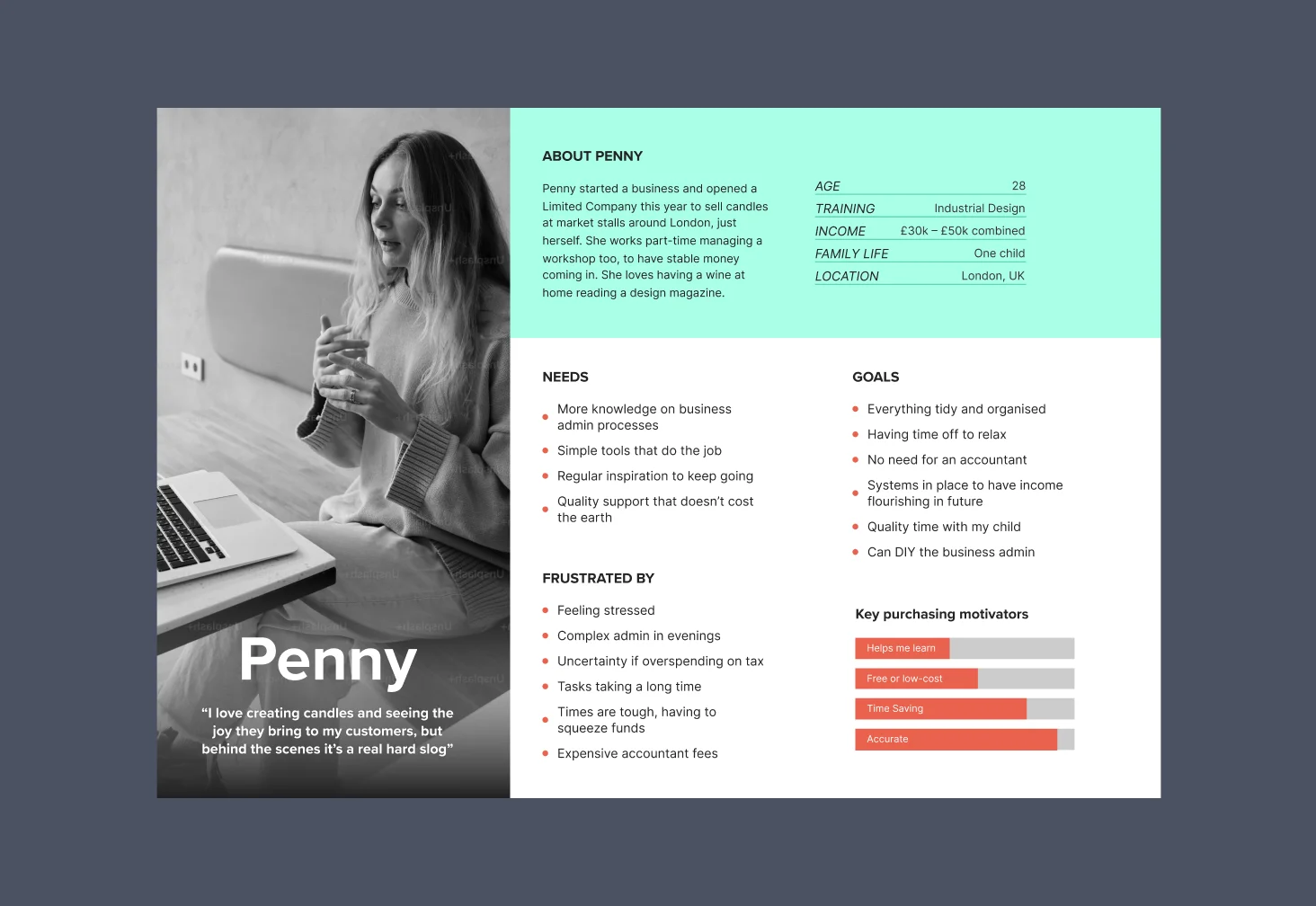
Persona generation
I created a new persona from research I had already done as a larger project.
I focussed on company owners who might need to pay themselves a salary and pulled together their perspective on running a business.
This helped provide an understanding of who the user was, and their motivations, and I referred back to it during the design phase.

Additional research interviews
To deep-dive on pain points, I contacted customers in our customer base and asked them a few questions regarding their perspective on payroll.
Some specific problems came out of the conversations.
Step 2
Summarising the insights
From my two research initiatives I gained an understanding of our user and their pain-points.
Step 3
Articulate the problem
Based on understanding our audience and their pain points, I articulated the problem we would focus on.
Step 4
Ideation
We threw around some ideas on different ways we could solve the problem and weighed up the pros and cons before picking a direction.
Idea 1
We wondered if we could enlist an army of accountants who could file payroll for our clients at a cheaper rate.

Idea 2
We considered making learning content that customers could use to file payroll themselves through the free HMRC tool.

Idea 3
Could we create an online digital tool that people could use to file payroll themselves in a simple way?
Solution choice
We chose idea 3 as it aligns with ANNA's SaaS model, being automated, scalable, and not reliant on human resources. It also offers a better user experience than idea 2.
Step 5
Competitive Analysis
Now we knew which direction we would head in, I conducted desk research into similar tools that already existed.
Existing solutions, analysed
This was a great way to see how complex issues were dealt with by other tools.
Positive factors where when competitors used simple language and broke content into bite-sized chunks.
Negative factors included vast amounts of information for users to take in.
Step 6
Outlining experiences
From having an awareness of the user, their perspective and their problems that needed solving, I began designing.
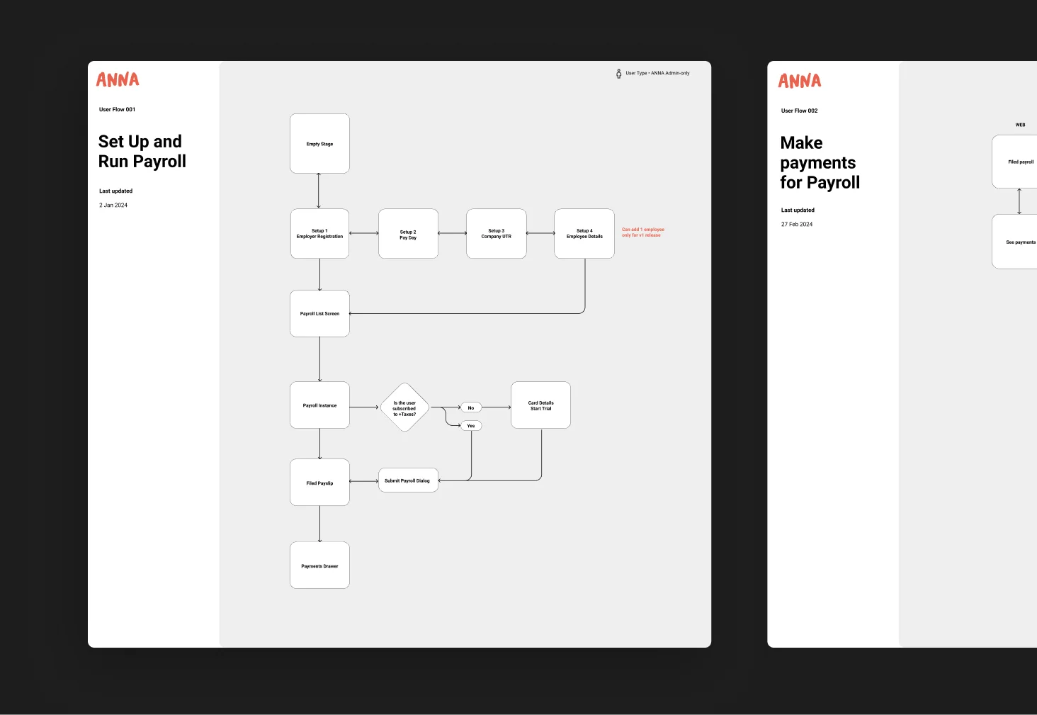
User flows
I created user flows so we could see how many screens were needed. The team got an awareness of what kind of experience we would be creating.
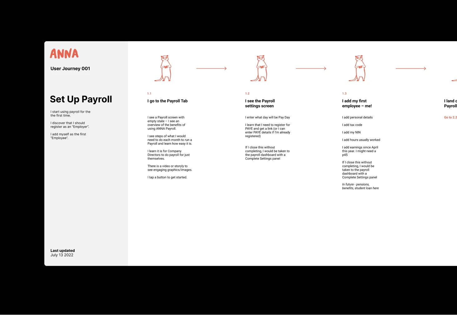
Customer journeys
I outlined the steps that users would take to complete payroll tasks. These served as a great asset for everyone in the team to grasp and collaborate on what we would build. I explored how simply users could acheive their goals.
Step 7
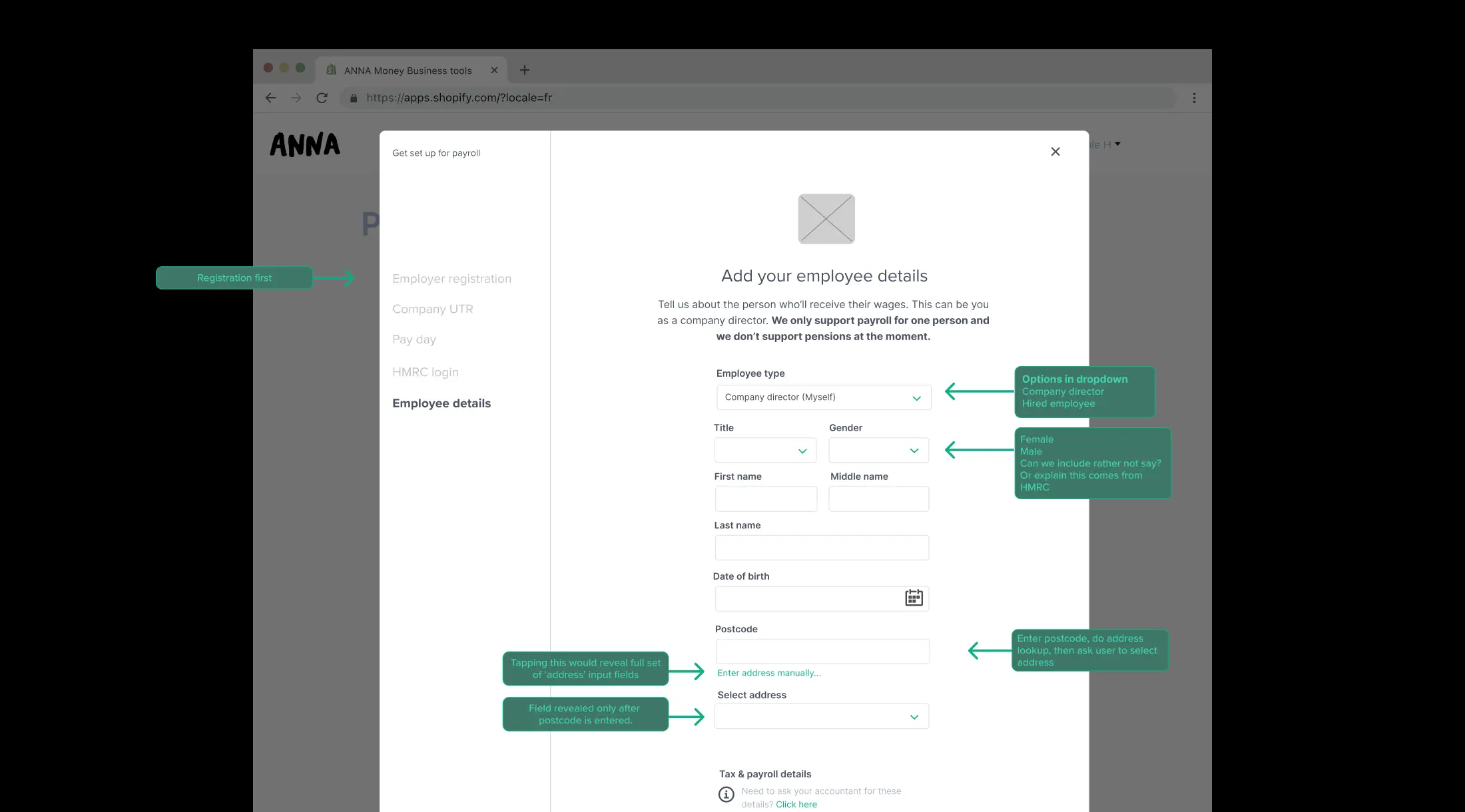
Wireframes
Our fledgling Design System was too basic to support a payroll tool. Wireframes helped me quickly establish what new UI components we would need to create. It also helped me explore options and specify states. I approached these with an eye on the audiences’ needs.
Defining onboarding
I explored different ways to structure the onboarding information. I knew onboarding needed to feel simple, so I corridor tested a few IA options and settled on a logical order, for example a seperately required registration process comes first.
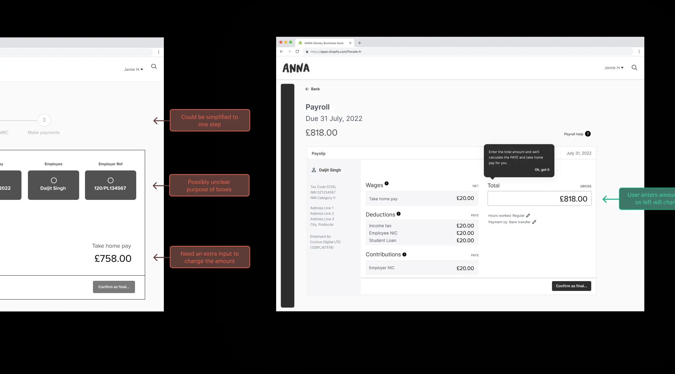
Exploring the payslip page
I explored different ways to help users run payroll in a way that felt obvious and was quick to do. I ruled out some aspects that felt unnecessary and unclear.
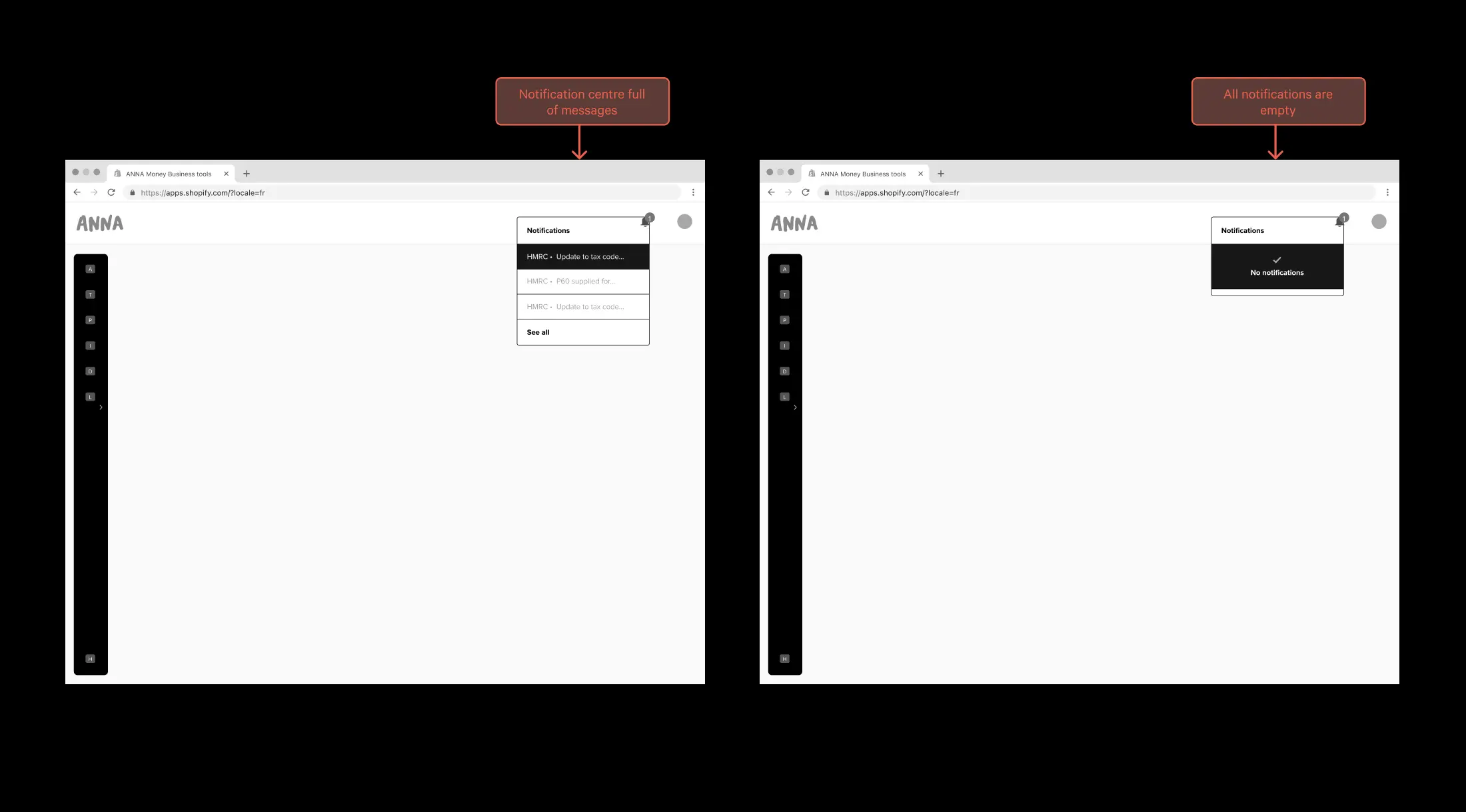
Exploring a notification centre
Customers said they wanted to stay on top of due dates and payments. I helped the team rule out notifications as a solution, and go with something more simple, because it was too time-consuming to produce a notification centre.
Step 8
User testing and iterating
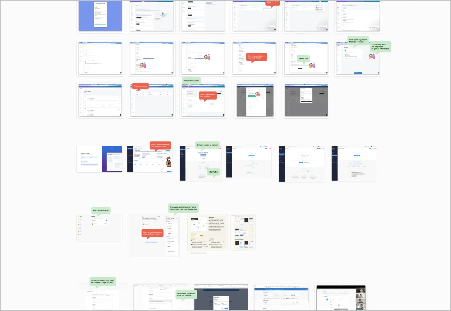
Before we went to build, I created a Figma prototype in medium fidelity, and I recruited testers in our customer base to try out the tool.
Figma prototype for testing
I created a Figma prototype and recruited people from our customer base to test it. I received five participants, this was good but more would have been better to confirm feedback themes.
I wrote the user testing script with open questions, so that we could see which areas needed improving and which areas created a positive response.
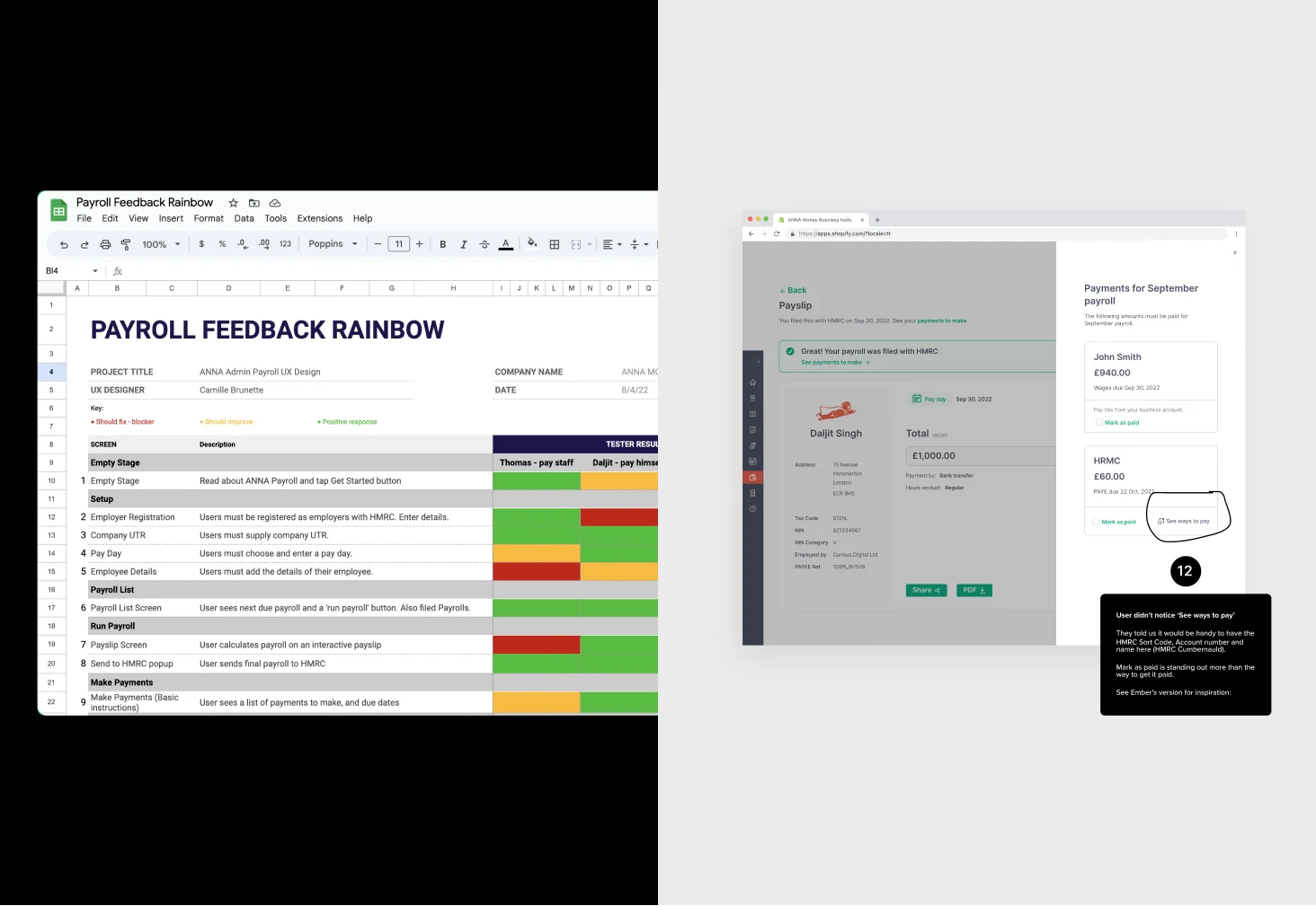
Synthesising the results and making changes
I synthesised the test results in rainbow format which helped me ascertain the strongest themes and organise the elements to address.
Then, I marked up changes in our design file for me and the other designer to action right away.
Step 9
UI Design
I created screens using components we had used previously, or I added new components to our UI library.
Designing screens using components
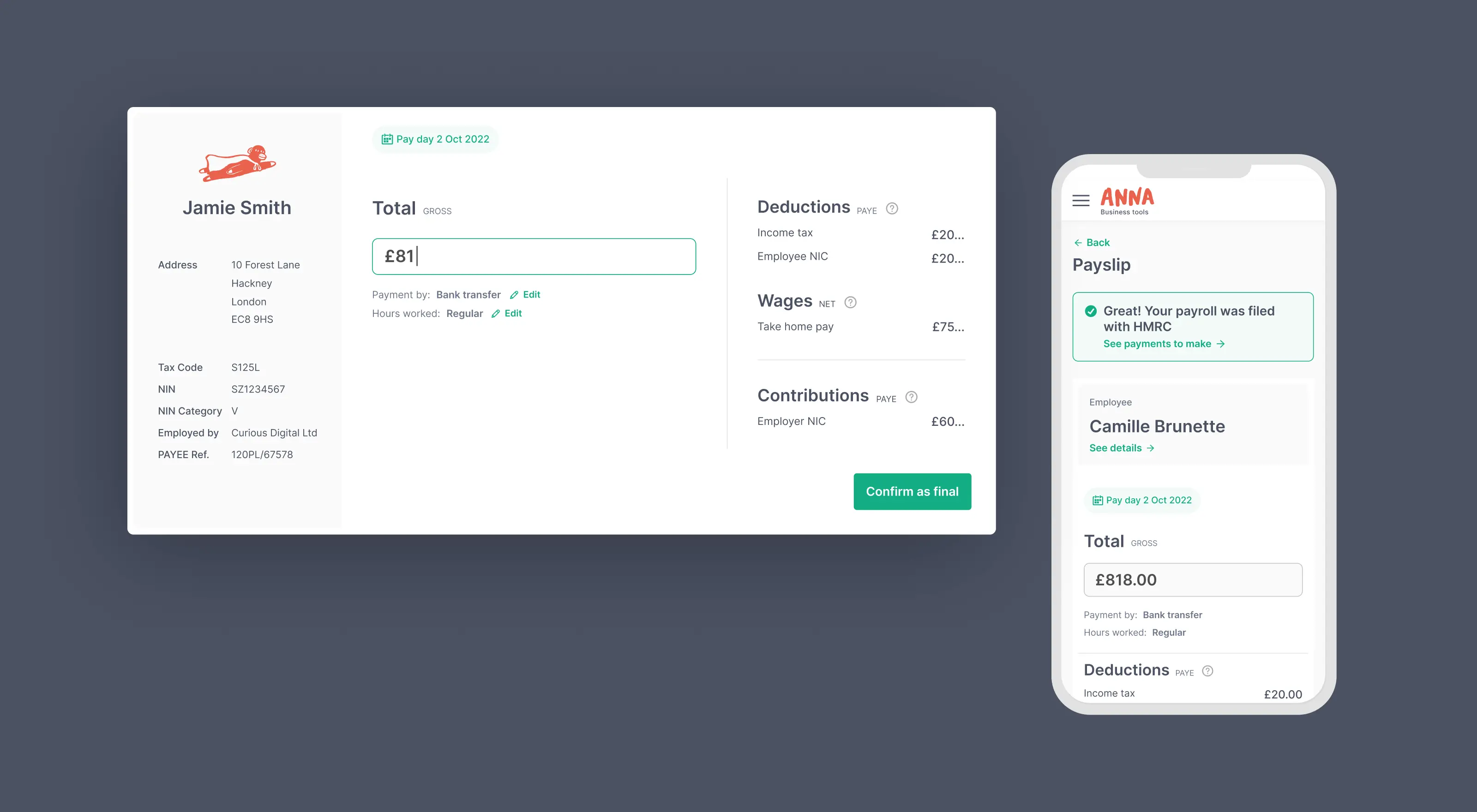
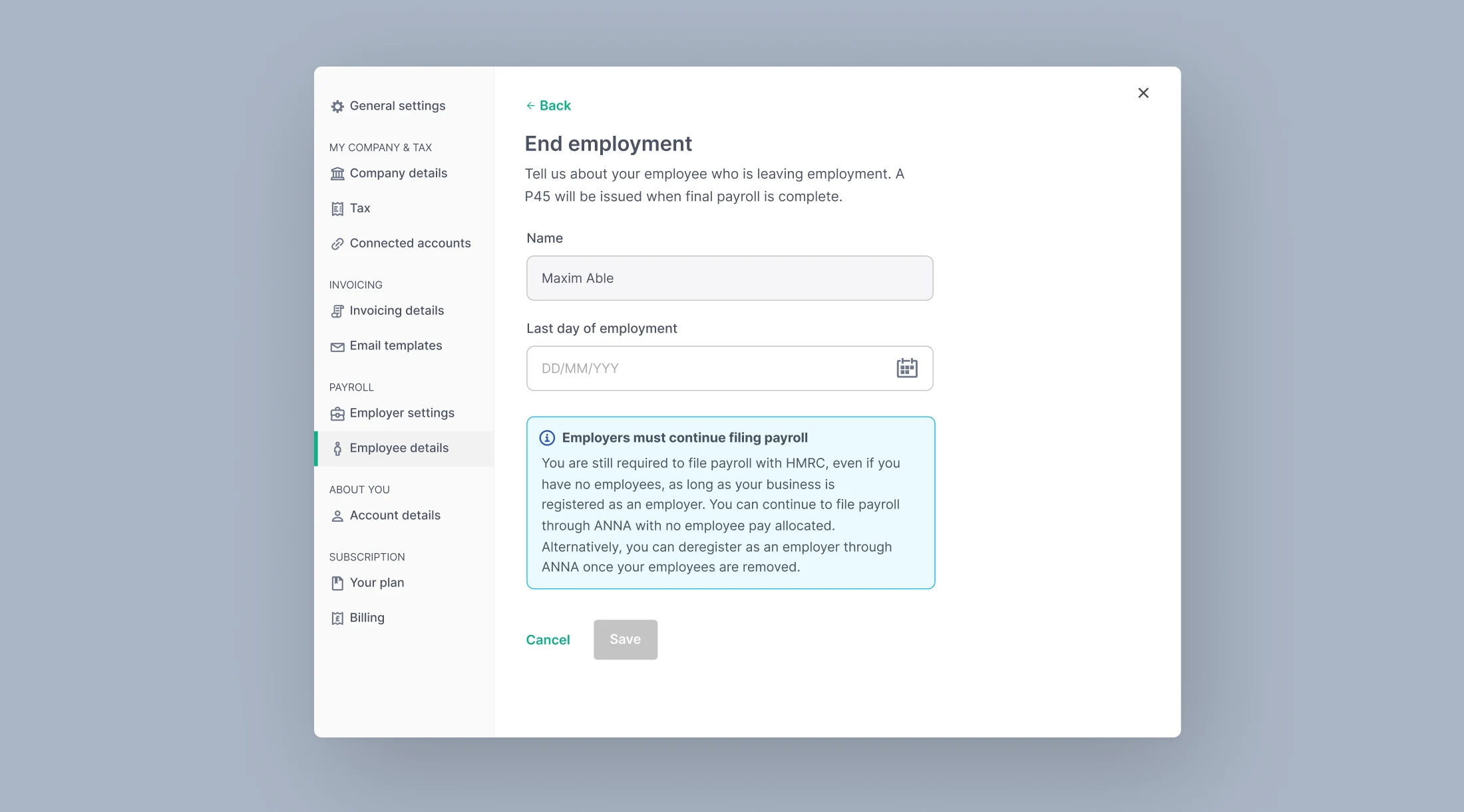
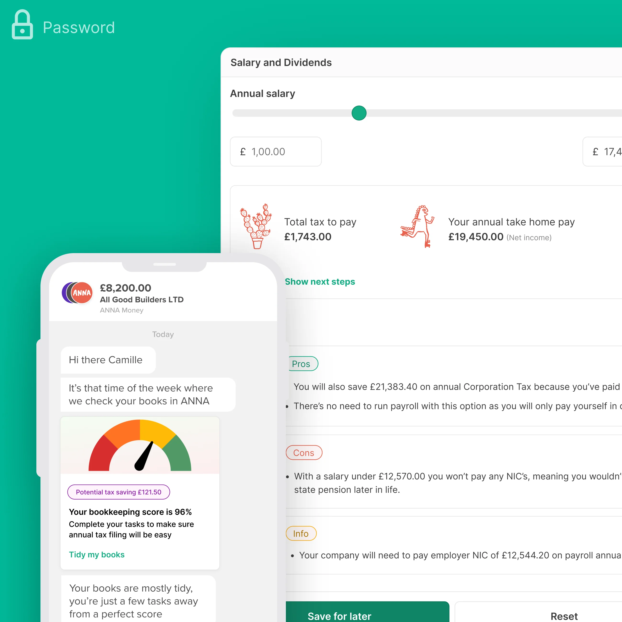
Here is an example of a screen I designed for payroll using existing components. It helps users terminate employees, learn about running final payroll, and obtain a P45.
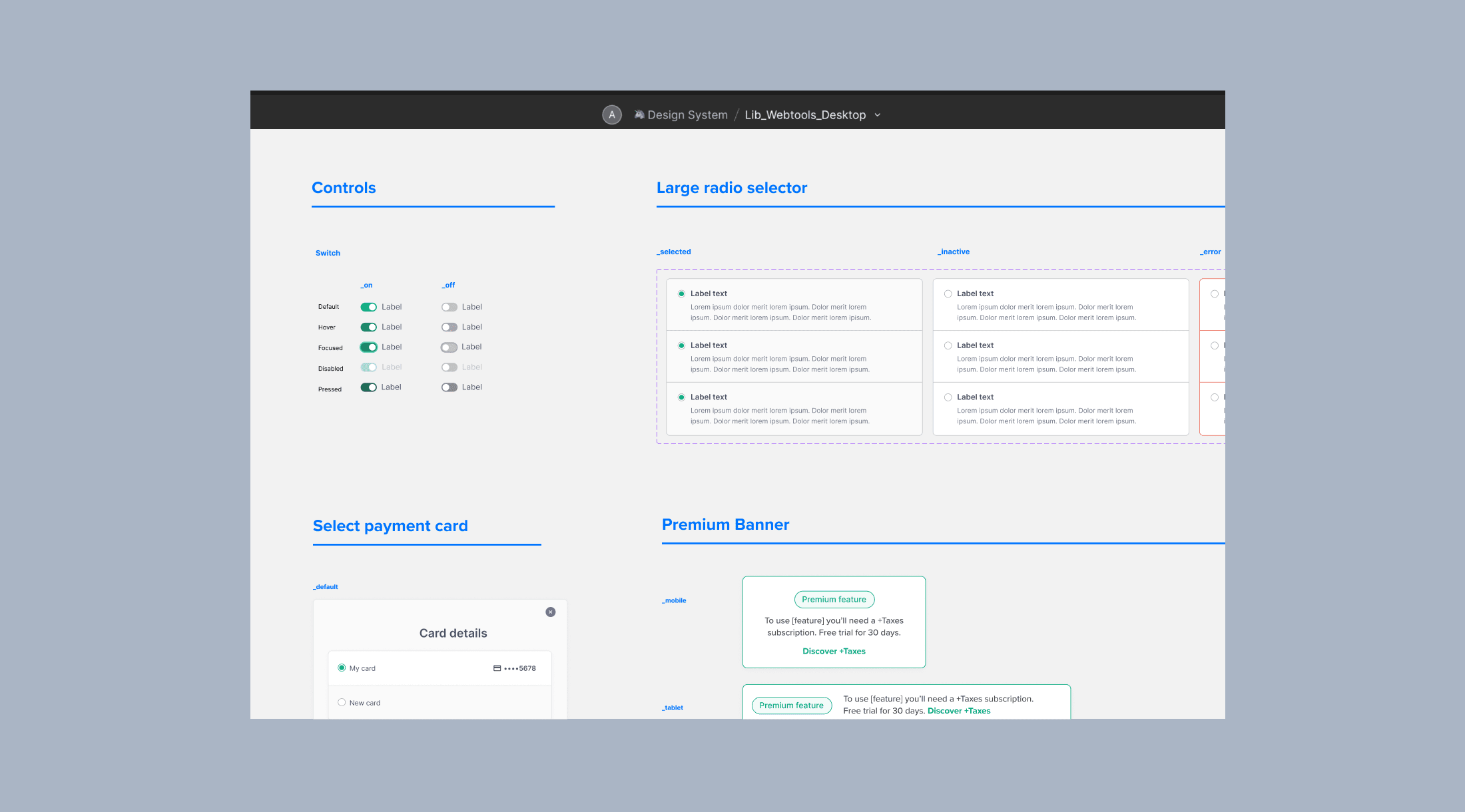
Maintaining a Design System
Two different designers started the Design System and library, and after they left or were moved onto other projects I took over to re-organise the library and add new components that were required as we extended features.
Solutions – take a look
View some of the final solutions. The rationale for the design approach is listed under each image.
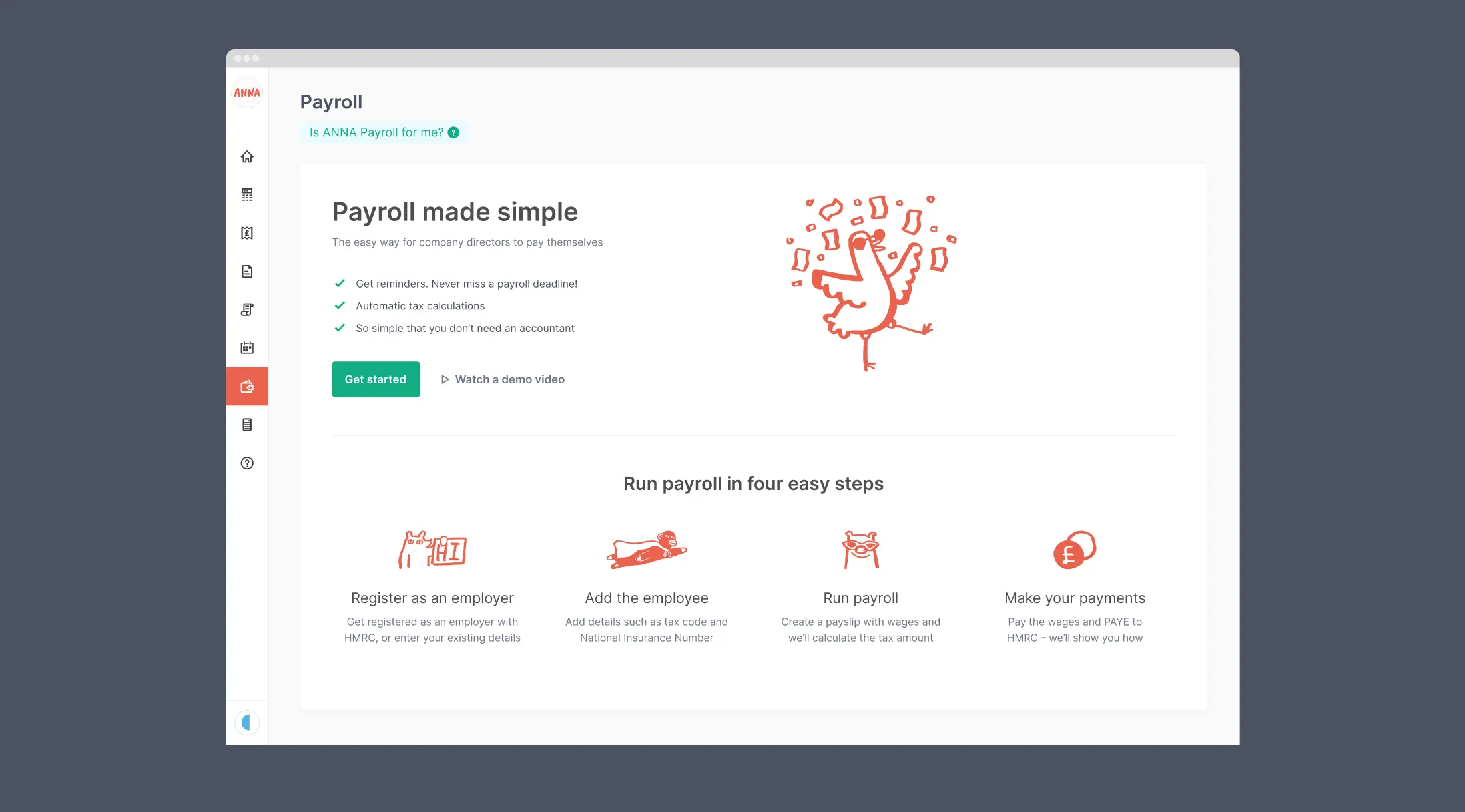
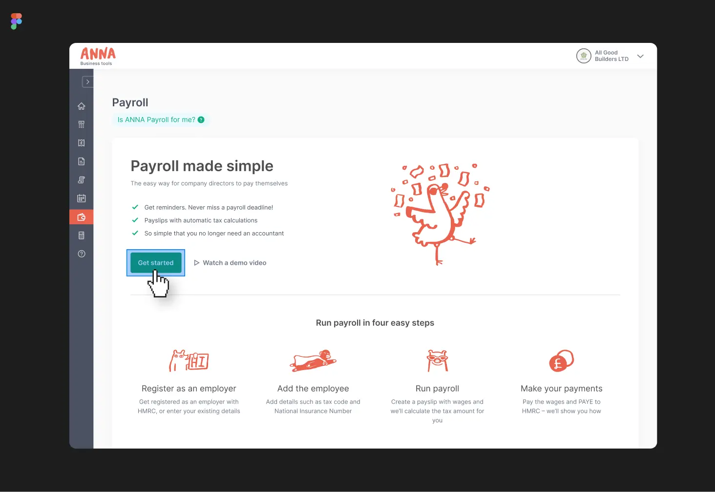
An empty state page that drives action
Our audience said they don’t know how payroll works, but they want to do business admin “in DIY style” as much as possible. I created a page that describes the payroll process simply, giving them confidence to get started with the ANNA tool.
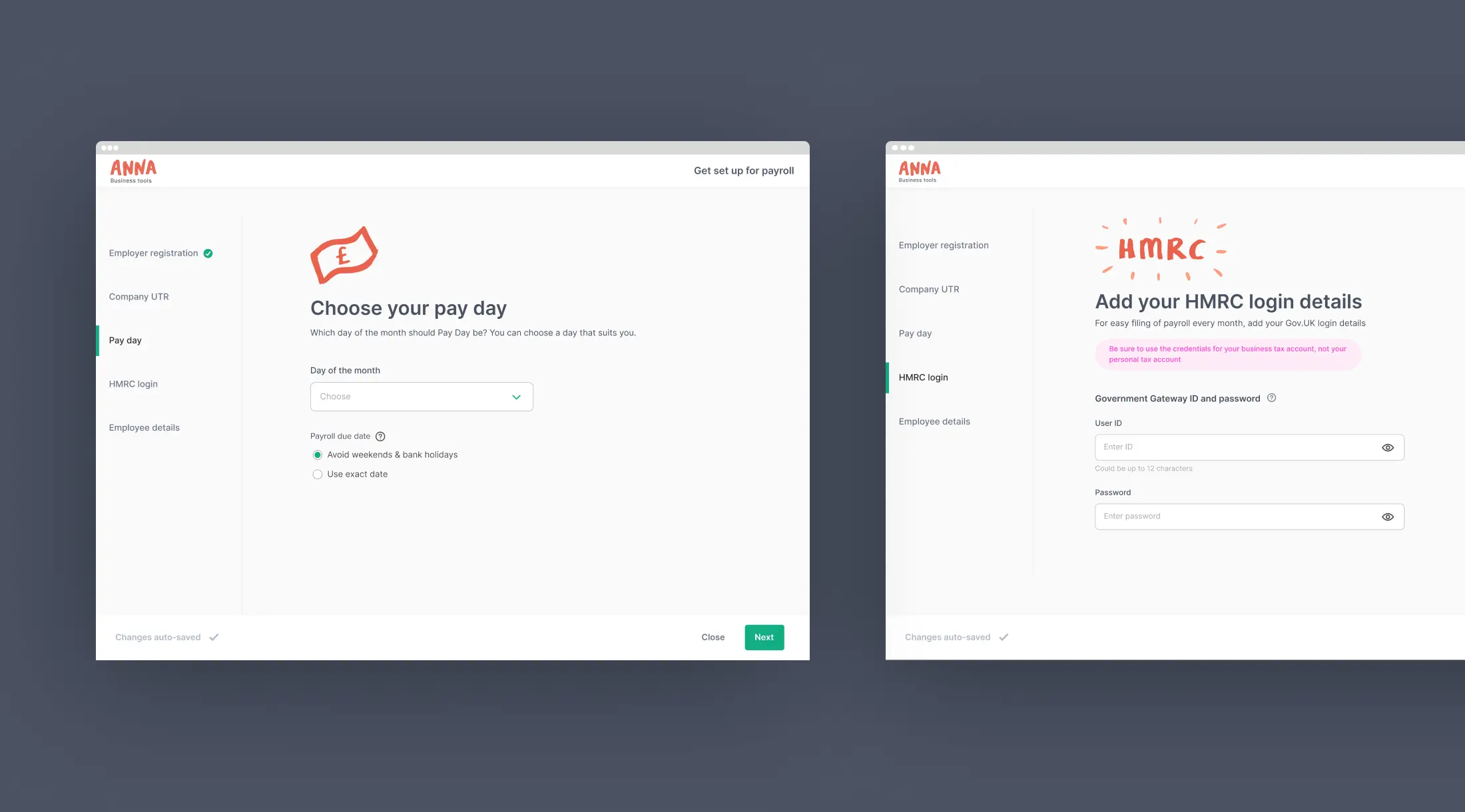
Easy breezy onboarding
Users told me they lacked knowledge of payroll, and were time-poor. I defined an onboarding experience that helps users understand complex information quickly using help tips and simple language.
Because business owners often feel stressed, I counteracted this with a look and feel that was breezy with lots of empty space and our joyful brand images.
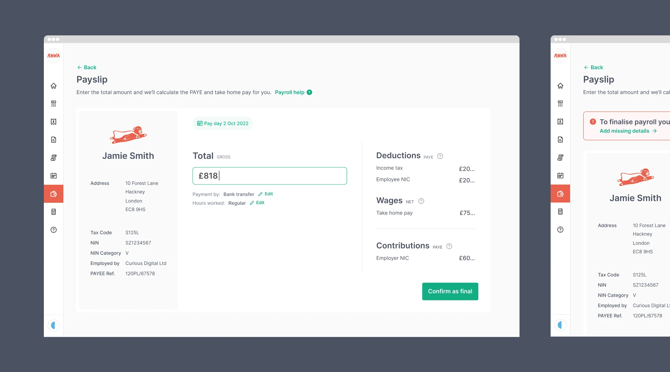
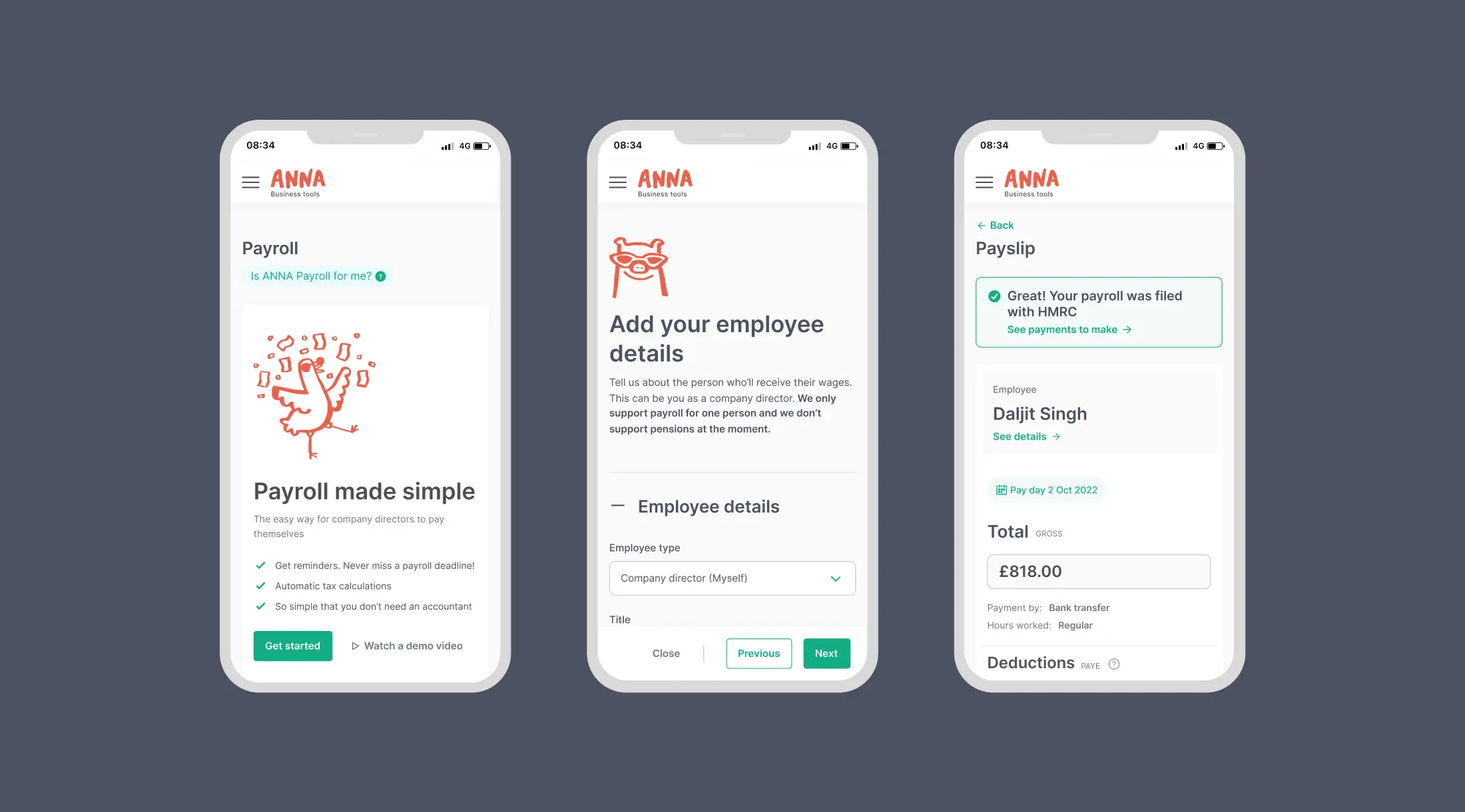
Run payroll intuitively
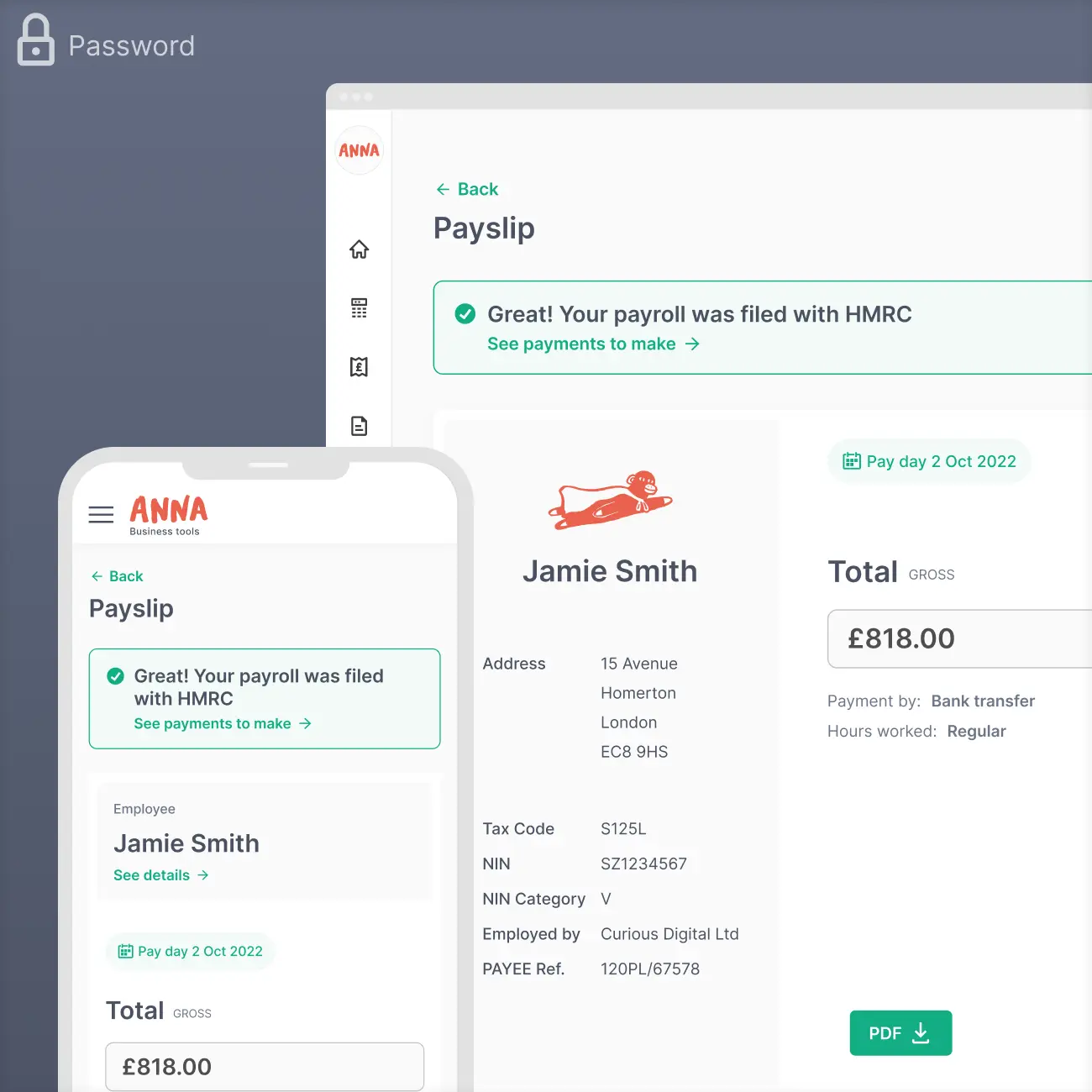
When the user runs payroll, they enter a total amount and the tax is calculated and shown in real-time. Business owners get a clear understanding of the tax costs, which is something they told me they need.
I designed the step as an interactive payslip because this is intuitive and familiar.
Also, I made onboarding content skippable, and non-linear, so that users can try running payroll even if they didn’t have all the right details initially. The aim was to increase engagement early on, resulting in filing conversion (a key metric).
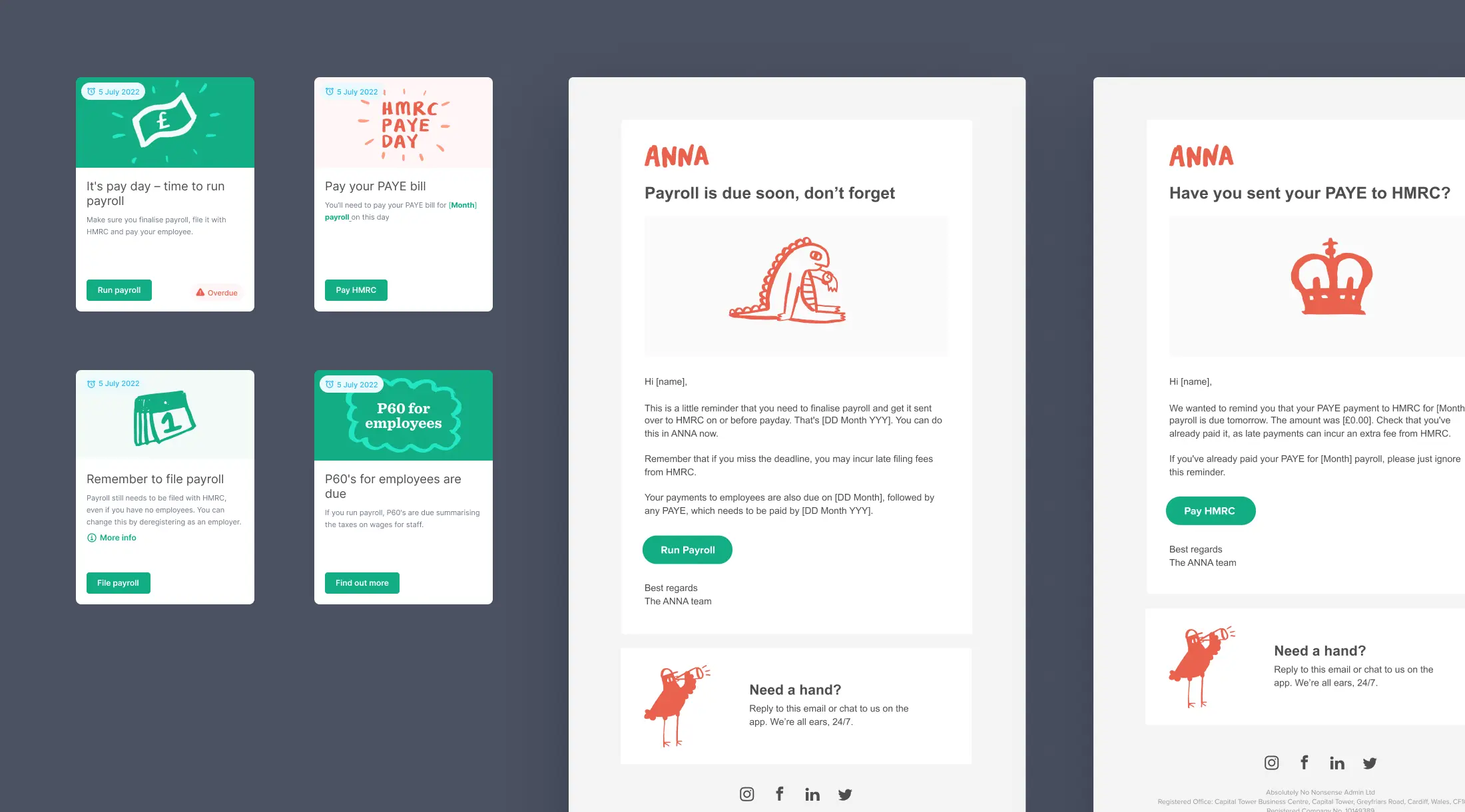
Payroll reminders
Customers told us they were afraid of missing payroll deadlines, so I built in guard-rails to protect them. I defined emails and dashboard cards that reminded users when payroll tasks were due. I’m happy writing copy, so I wrote all this up before giving it to a copy-writer to check it.
Fully responsive
We knew that business owners are always running around managing a lot of things. I made sure the site worked well on a mobile viewport, in case users needed to run payroll on the go. This was done by carefully considering how the components changed from web to mobile.
Results
We successfully created a new funnel of users that actively use our free tool.

New accounts and filings
In a short timeframe, we achieved 16,899 new accounts and 516 unique payroll filers, an impressive amount.

Ability to gain revenue
The business impact has been significant as we transitioned to upselling paid plans to the users with free accounts.

Good onboarding conversion
The onboarding completion rate is good, and I'm reviewing screen recordings for further improvements.
Monitoring the funnel
I analysed figures, creating a diagram to track the tool's performance after release. We expected drop-offs from feature limitations; I reminded the team about improvement opportunities.
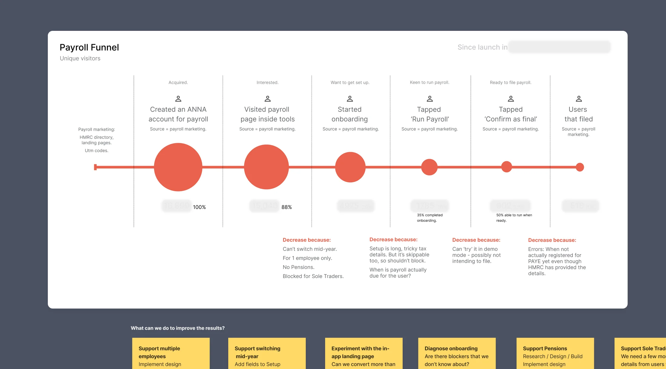
Making improvements
I kept track of the factors causing drop-offs and proposed solutions. We're consistently enhancing the tool through weekly sprints, addressing crucial features like supporting multiple employees and mid-year tool adoption.
More from Camille’s portfolio
Payroll for ANNA Money
PRODUCT DESIGN
+Taxes for ANNA Money
PRODUCT DESIGN
Invoicing for ANNA Money
PRODUCT DESIGN
Galderma SEO Microsite
UX DESIGN
Techspace
UX/UI DESIGN
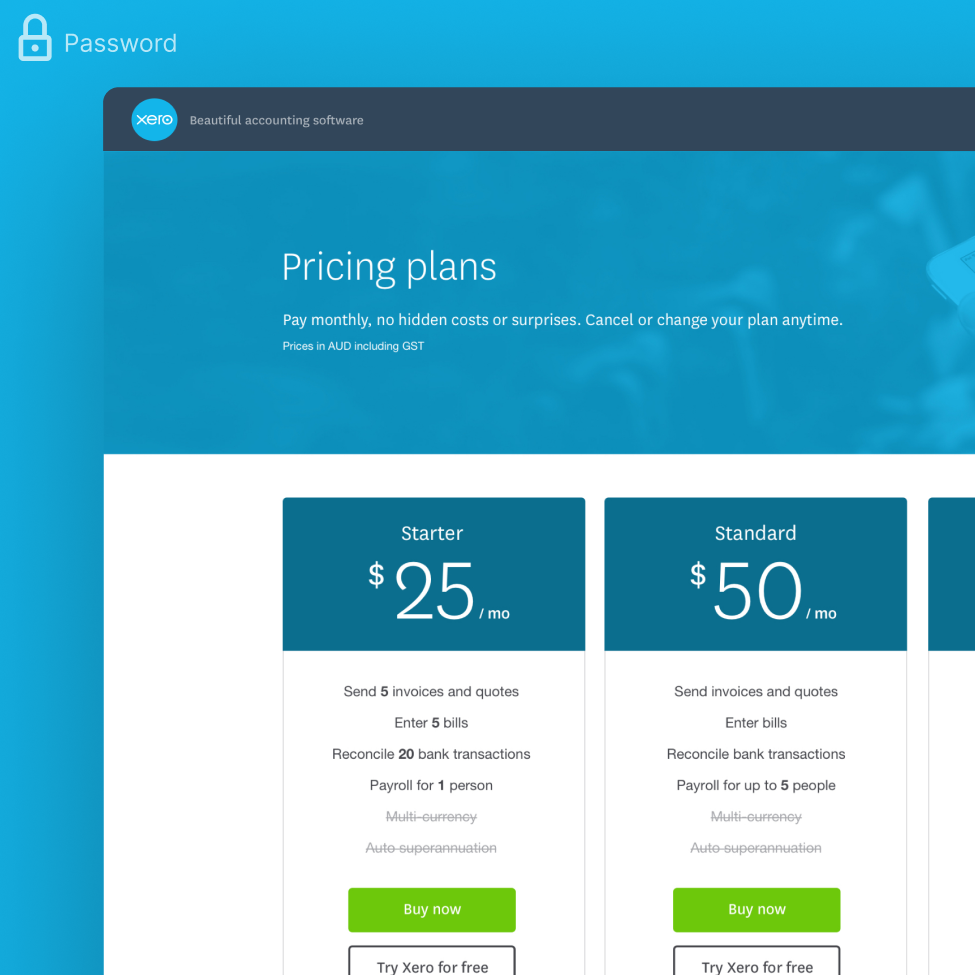
Xero Pricing Plans
UX/UI DESIGN