+Taxes for ANNA Money
I designed a product for small business owners to get tax peace of mind. It contained a set of features on a premium plan, released through the mobile app and a web platform.
My contribution:
Year
• Conduct UX design
• Conduct research
• Design UI when
required
2022

The client
ANNA Money provides two solutions to small business owners. Bank accounts, and digital tools for business admin.
The challenge
Our aim was to develop a new tax solution for business owners but we also had to work within tight technical scope.

Project metrics
We chased one key metric:
- Number of trials and paying customers.
On our new premium subscription plan, which we called +Taxes.

Who was on board?
- 2 x Product owners
- 6 x Engineers
- 1 x Product Design Lead – Camille
- 1 x UI Designer (initially)

My contribution
I led the design process, conducting UX and UI. Another designer was onboard initially to also design UI. The Head of Product Design signed off the experience.
Time frame
We designed and released our MVP in around 2 months. Over a further 4 months, we designed and released better features.
Step 1
Discovery research
First I used my UX research skills to understand the target customers and their pain points. I used the insight generated to make user-centric decisions while designing.

Persona generation
I conducted interviews with customers to understand who they were, their motivations and frustrations, and their typical business day.
I synthesised interview content into personas. Other members of the design team did this too, for their own projects they had on the go.

Running a workshop with our customer panel
I conducted a workshop session that gathered feedback on the idea of our new product – peace of mind for company tax and filing.
I probed it’s strengths and weaknesses, blockers to entry, and the customer’s perspective on it.
Step 2
Key customer insights
By researching our audience, I had a clear picture of business owners and their perspective on tax filing.
Step 3
The problem
I generated a problem statement to sharpen our focus on this project.
Step 4
Competitive Analysis
Now that we knew the problem we would try to solve, the product owner and I both fed in with a number of competitive analysis tasks.

Competitive matrix
The Product Owner added similar products and their features to a matrix. It helped us see what kinds of solutions were already provided in the market.

Competitor deep dive
I researched products by trialing their platform or taking part in demos. Luckily, I needed a live tool for my own business, so it was great to connect with market offerings.
Step 5
Scrappy ideation workshop
As a very small cross-functional product team, I encouraged us to get together and conduct a Crazy-8’s exercise for our MVP goal.

Crazy 8’s
I led the small team in a Crazy 8 exercise, conducting idea generation on what a minimum viable product might be. We sketched with the question "How might we" in mind (to achieve subscribers).
Affinity mapping
I took our ideas and organised them with the group using sticky notes (top right). This helped us identify our key ideas.
Sketching a high level flow
Taking our key ideas, we established as a group a high level user flow and the basic experiences that users would interact with for our MVP (bottom right).
Step 6
Designing the MVP
Now that we had a vision for the MVP of our premium subscription product, I began to detail out the journey and wireframes.

High level flow
I mapped a simple user flow in order to understand what screens we would need to design and develop to release an MVP. This I shared with the product owner and lead engineer for alignment.

Wireframes
From the user research I knew that users wanted tools that were customised to their own business and helped them do things like calculate taxes easily.
I began drafting wireframes for onboarding that communicated our product would meet these needs.

Fully designed screens for MVP
Our visual designer and I created final screens and specs for the engineers so that we could quickly release an MVP to the market.
We started the process of building out a new Figma Design System. This was our first web-based platform tool – previously we had been designing for the mobile app.
Step 7
How did the MVP do?
Not great, conversion from trial to subscription was low. We had proved that the funnel worked and that customers valued the proposition, but we set out to add experiences that would convert better.

Adding new experiences
In the MVP, there was only an onboarding flow and a rudimentary way to do bookkeeping and file taxes. The product owner and I agreed on new features we would add.
This included a dashboard, delightful bookkeeping, a tax estimate, a tax calculator, and a calendar for deadlines. These features more closely met the user’s expectation of an informative and 'DIY' style tax filing solution.
Step 8
Wire-framing new solutions
I created wireframes to develop solutions that more deeply solved the users’ pain-points identified in research.

Dashboard
I explored ways for users to easily complete tax tasks, and see how much tax they owe.
Earlier designs used a more familiar layout with reports and boxes.
After sharing ideas with the design team, I went forward with a design based on a timeline, as it expressed information simply but also felt unique.

Bookkeeping Score
I explored how users might do their bookkeeping in a quick and pleasant way, to prepare for taxes. I led with a Card Stack style experience.
This would help to create engagement throughout the year, not just at filing time.

Tax Calculator
Users wanted to predict the tax costs if they pay themselves from the business.
I explored ways to make complex information understandable. I made sure to understand the content as much as possible, and display it in a simple way.
Step 9
User testing
I created interactive prototypes in Figma to rapidly test my concepts with real users who I had recruited. From the testing I learned what needed to be adjusted for better engagement.

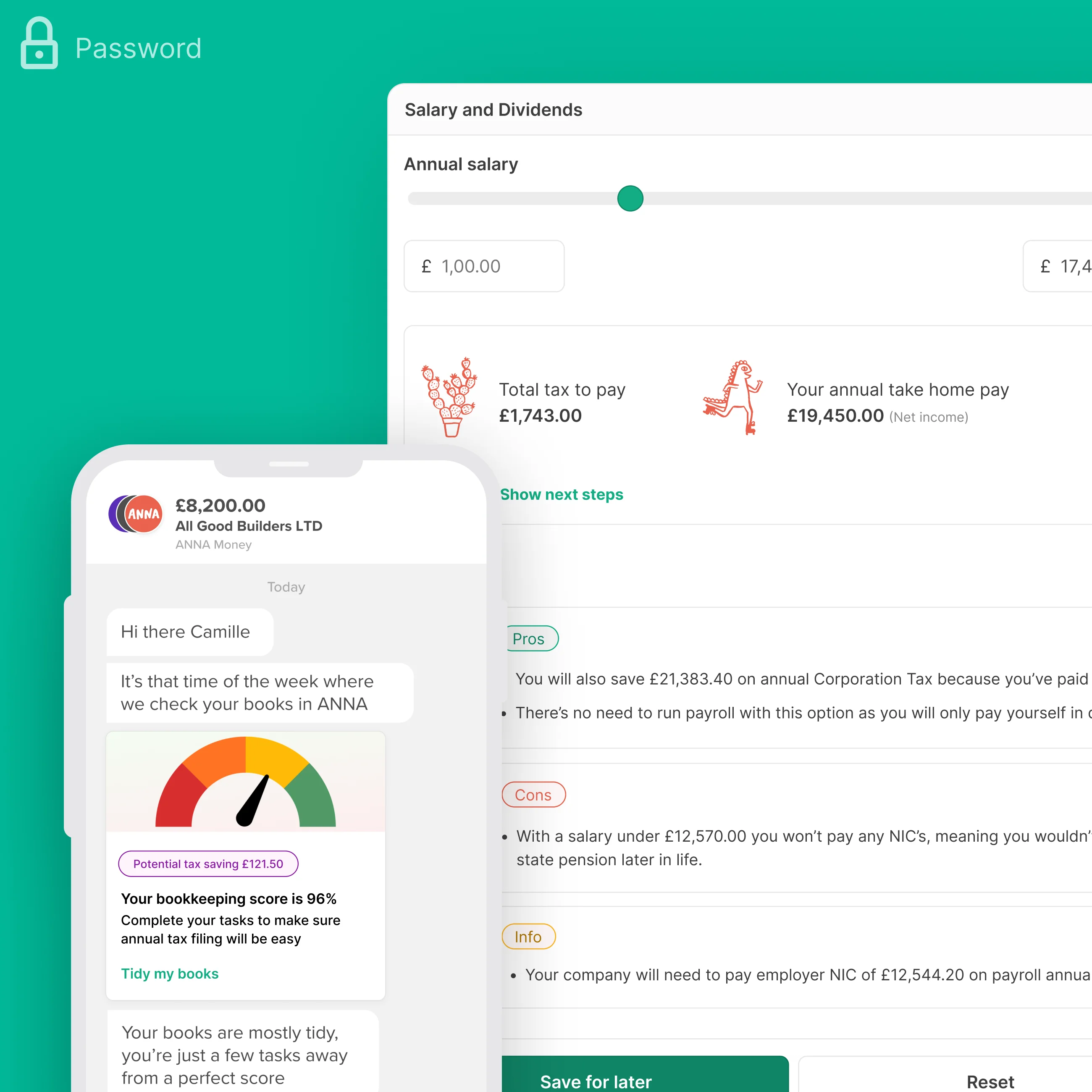
Testing the Bookkeeping Score
Things I learned:
- Users loved the score because it provided clarity.
- The type of tasks we suggested matched the users’ mental model.
- The UI for changing tax categories needed to be more clear.

Testing the Tax Calculator
Things I learned:
- Users loved comparing ways to pay themselves at a glance.
- Users wanted to fiddle with knobs more than they wanted to read a guide.
- Tax jargon needed to be minimised for a clear understanding.

Sharing results and making changes
I summarised the user testing results in a presentation deck and shared them with our cross-functional team.
I kept a list of improvements to make to the UX and UI, and ticked them off as I progressed.
Step 10
UI Design
I created final screens using our Design System library, and added new components when we needed them.

Creating screens from components
There was a design system in place containing components that were useful to create screens from.
Using this, I created screens to be developer-ready in a quick manner, such as a new version of our tax calculator shown here.
I included joyful illustrations and structured content in a Pros & Cons format, making it easy to understand.

Creating new components
If a component had not been created in our Design System, I designed a new component and published it.
Here are some examples of the components I added to our initial design library as we progressed.
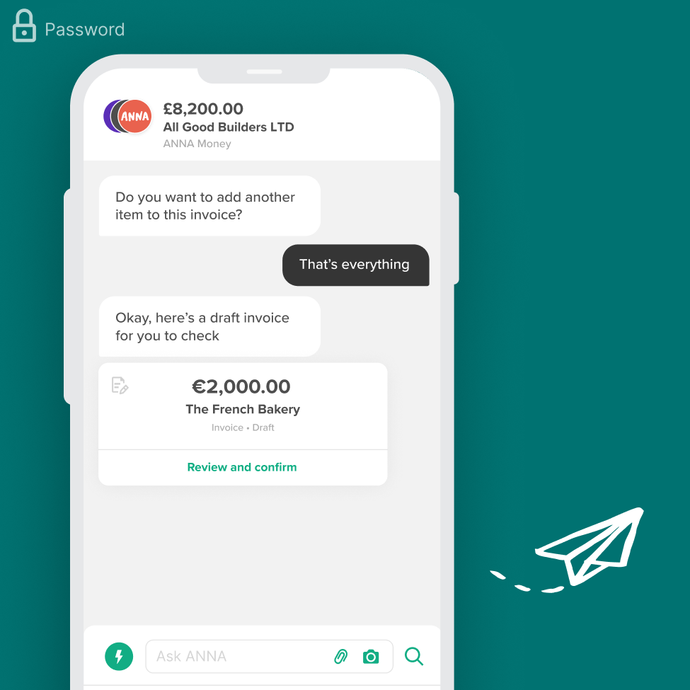
Final solutions
Our new product contained a dashboard, bookkeeping, a tax calculator and an annual tax summary that could be filed through ANNA with the help of the support team.

Dashboard
Customers told us they wanted to reach
‘inbox zero’ for tax admin. The
dashboard I came up with presents tasks in a pleasant timeline
format making it simple to see what needs doing, and it helps
them get it done. I protected the content so that only important
tasks due in the next fortnight are shown to the user.
Users also see an ever-present
tax estimate on their dashboard.
I created wireframes, images, copy, and defined states of the
UI, eg. empty states. A visual designer was onboard initially to
set image style and define details like scrolling behaviour.

Bookkeeping Score
I designed an experience that makes
bookkeeping delightful. In the mobile
app, users tidy their books and are rewarded with a high score.
I used the Card Stack pattern to give users focus and I included mention of
tax savings to be made.
Customers told us they wanted their businesses to
run on auto-pilot, and this feature
is built upon that with the automated cleaning of books as a
basis.
In collaboration with a visual designer, we fine-tuned the artwork, focusing on UI elements like meter colors.
The promotional chat skill I designed outperforms competitors, with over 30% of ANNA's customers engaging in bookkeeping tasks; completing a task increases subscription conversion rates by over 50%.

Tax Calculator
Users wanted to know
how much they can pay themselves (and
what the tax cost would be).
I created a tactile experience that includes sliders, so users
can discover costs in a pleasant manner. From my user testing, I
knew that users loved the three cards that help them compare
ways to pay themselves.
The tool helps them manage taxes with
confidence and
save money when doing it.

Tax Calendar
We knew that customers were
afraid of missing tax filing deadlines,
so we included a calendar that is personalised to the business
and their unique tax filing dates. Users tap their events and
read useful information.
For this timeline view, I collaborated with a tax expert, wrote
copy, mocked up screens with components, considered the wider
flow, and helped with QA testing.

Corporation Tax Filing
Users were very keen to see a
Corporation Tax estimate at any time throughout
the year. I added this figure to the customer dashboard, linking to a full breakdown.
After viewing a breakdown of their estimate, users can
file their taxes through
ANNA, with a bit of support from internal staff. In our next round we would look to help our customers file taxes completely themselves.
The impact
We created a new product that generates engagement throughout the year, with users cleaning their books and checking tax estimates, ready for filing.

Outstanding growth
Conversion from trial to paid improved from 0.8% to 25% when we shifted from our MVP to our fully-featured product.
Subscriptions to +Taxes are rising rapidly at ANNA, and have monumentally improved our business value.

Paying customers
The features I designed generate 33% of all subscriptions to the tax filing plan. The remainder come from a separate method that is always going to be hard to compete with.

Customer love
Here's a quote we received from a customer, out of the blue.
More from Camille’s portfolio
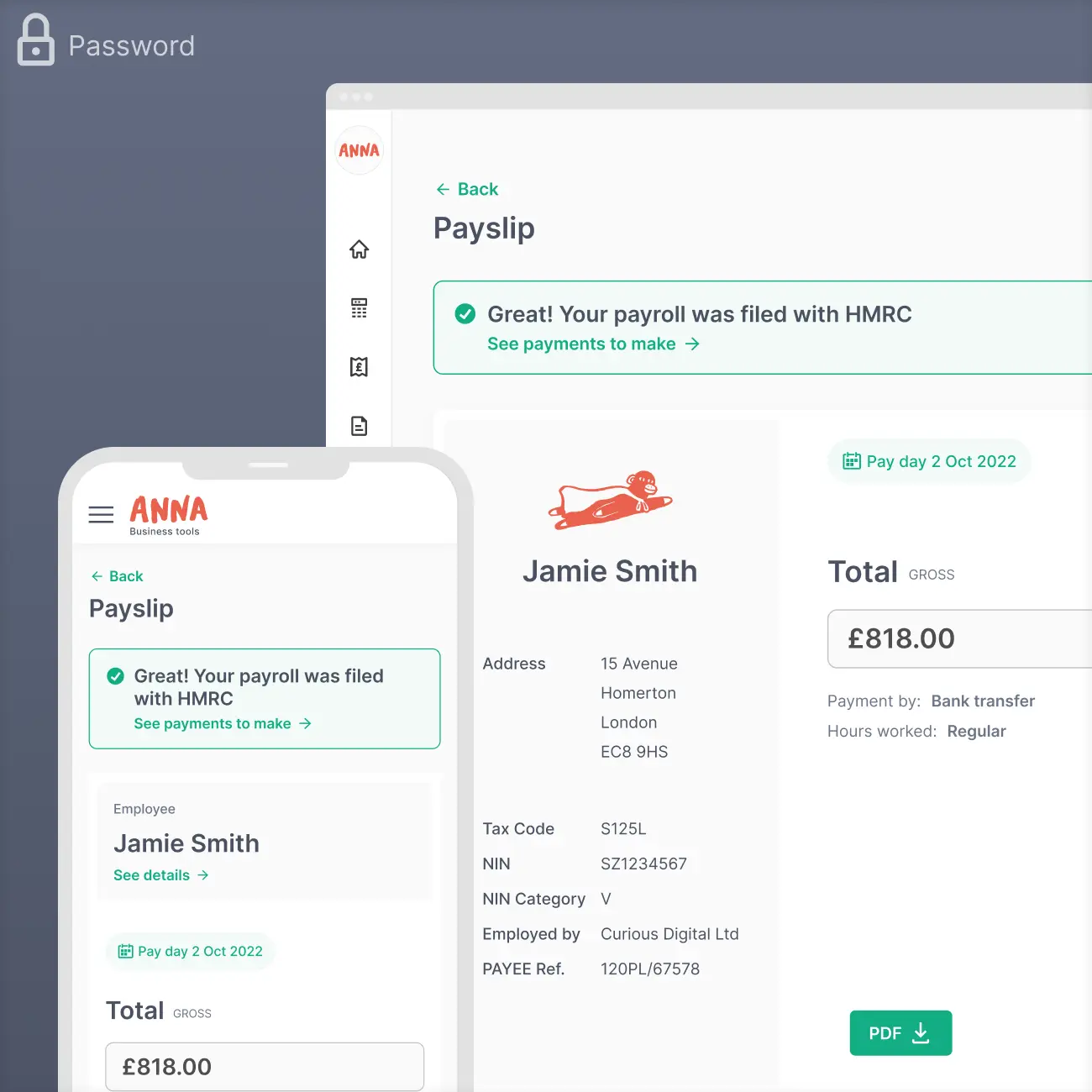
Payroll for ANNA Money
PRODUCT DESIGN
+Taxes for ANNA Money
PRODUCT DESIGN
Invoicing for ANNA Money
PRODUCT DESIGN
Galderma SEO Microsite
UX DESIGN
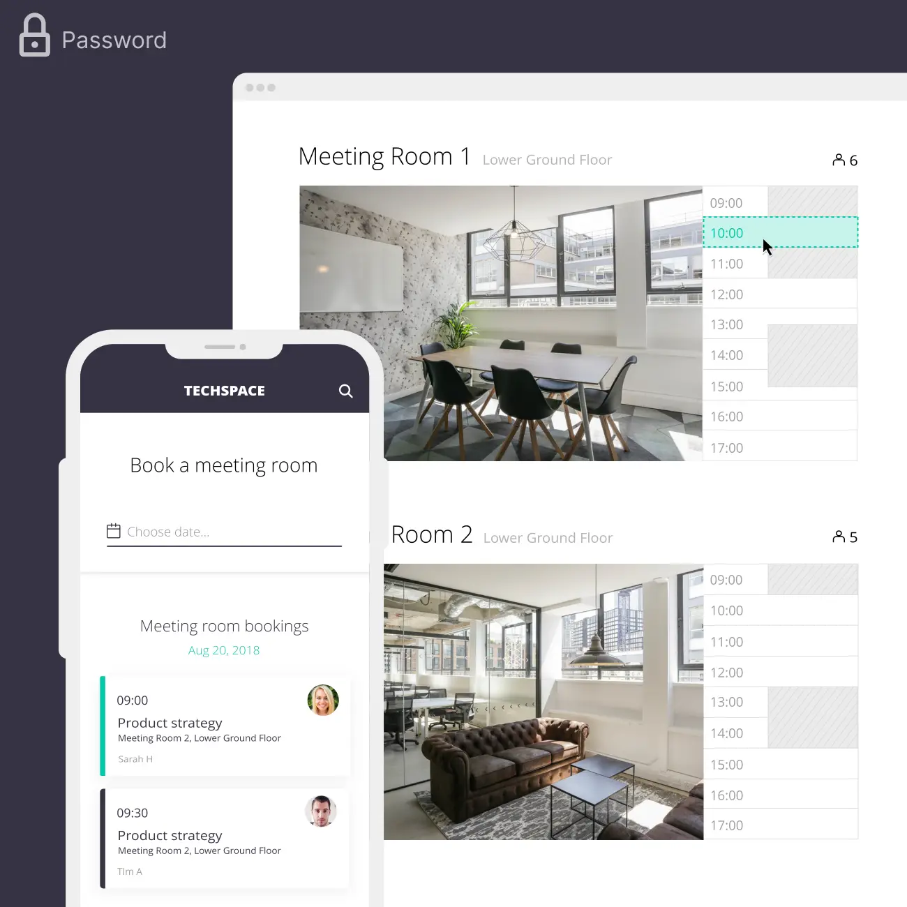
Techspace
UX/UI DESIGN
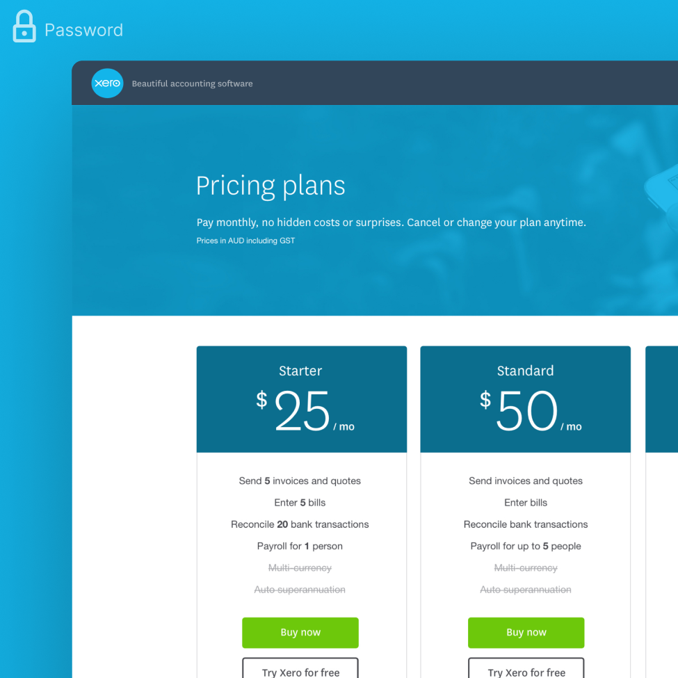
Xero Pricing Plans
UX/UI DESIGN