SEO Microsite for Galderma
I led UX design for a microsite with the result of improving engagement and increasing web traffic.
My role was to:
Year
• Conduct UX design
• Conduct research
• Define UI specs
2022
The client
Galderma is a global provider of beauty and medical products. Medical practitioners are their customers, who provide best-in-class treatments to their own clients.
The challenge
The aim was to redesign a blog-style microsite and reach more readers who would be interested in contacting practitioners for beauty treatments. We set out to design a site that was user friendly and leveraged SEO tactics for maximum impact.

Project metrics
We chased two key metrics:
- Increase in web traffic volume.
- Increase in people contacting medical practitioners through the site.
We also aimed to increase page views per session and decrease bounce.

Who was on board?
- 1 UX Design Lead – Me
- 1 Visual Designer
- 1 Art Director
- 2 Account Managers
- 3 Copywriters
- 1 CMS Lead

My contribution
I led UX Design on this project, conducting design and research.
Time frame
I spent several weeks to deliver the UX and UI requirements needed.
Step 1
Understand the user
I dove into the customer research insight previously generated for Galderma so that I could understand their preferences, needs, goals and motivations. Here were my biggest takeaways.
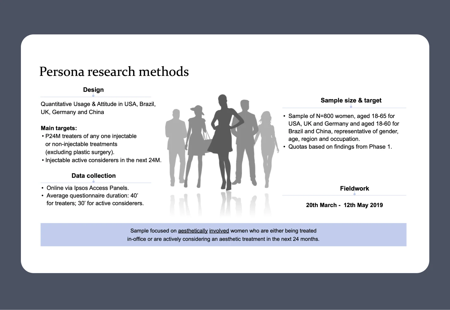
Thorough research
Galderma had thoroughly researched their target audience using online questionnaires with Ipsos. They’d gathered insight from audiences in USA, Brazil, UK, Germany, and China.
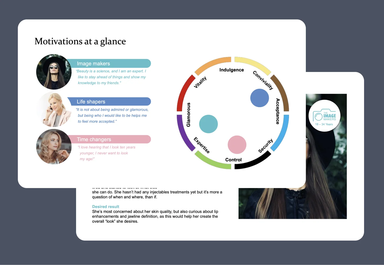
Who was our audience?
Insight was divided into three personas.
Key motivators included being an expert in beauty, for example as an influencer; understanding how to feel better in ones’ skin; and finding the best and healthiest ways to look younger.
Step 2
The problem to solve
It became clear from the user research and the competitor scan that there was space for a new solution to an apparent problem.
Step 3
Competitive Scan
Now that we knew the problem we would try to solve, as a team we scanned the market for related solutions, and general inspiration.
Relevant solutions
We learned from what our competitors did and did not do well. Even the most successful example was not up to the standard we would expect, with a lack of content and appeal.
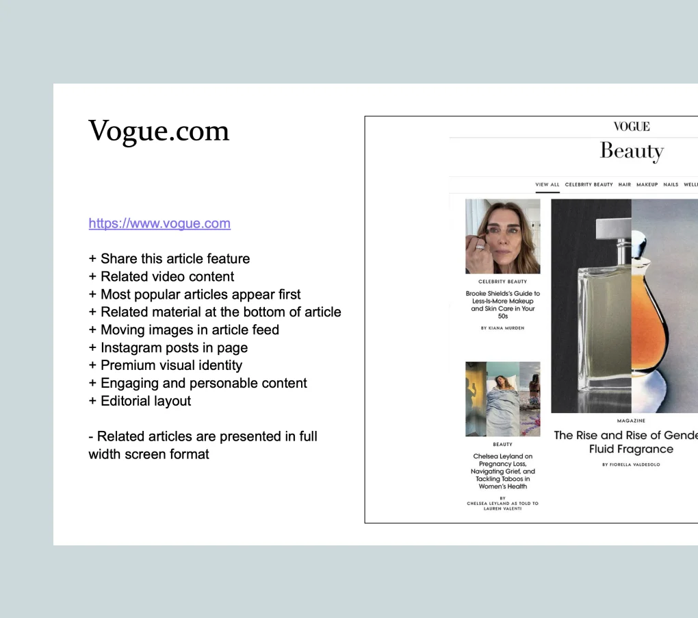
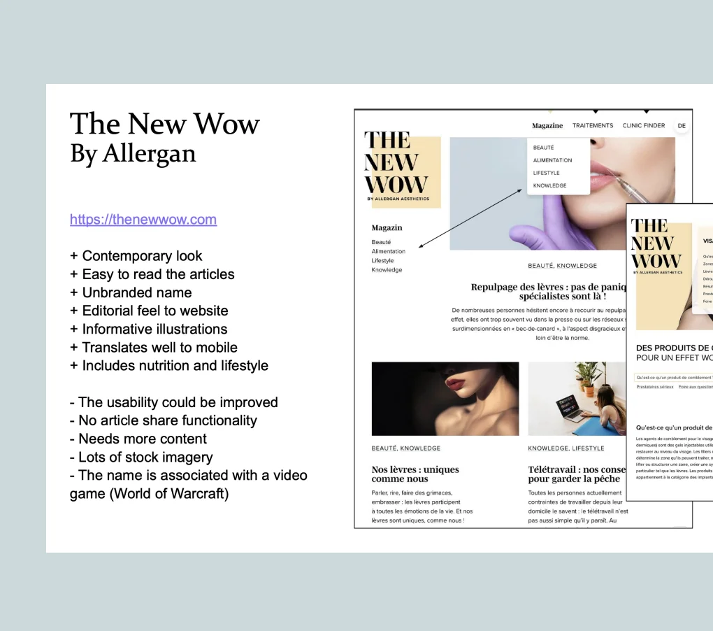
Inspiration points
There were many examples of editorial blog sites that sat outside of the industry which we gained inspiration from. We chose to focus on Vogue Beauty, L’Oreal and Allure, as they offered a mix of great user experience, functionality and a premium look and feel.
Step 4
Sitemap and SEO tactics
I began to lead on what experience we would create by setting good foundations and considering SEO needs.
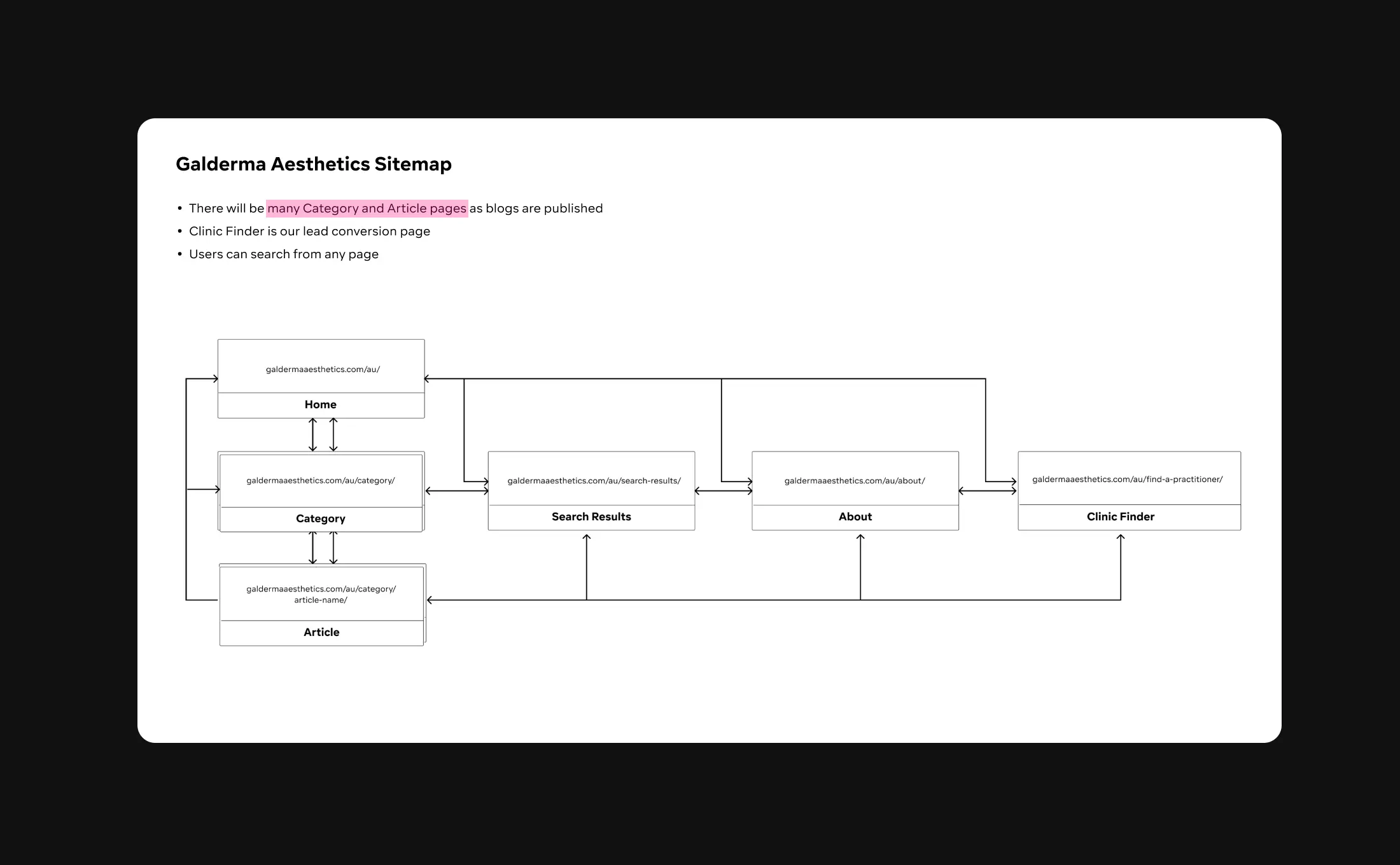
Sitemap
Based on the information given, I led the charge to create a site map. Gaining approval on this meant the team and client were all on the same page about project scope.
Incorporating SEO tactics
We incorporated SEO tactics on this project. Some key items on our checklist that I helped with included:
- Incorporating topic tags
- Adding authors to article pages
- Including external links to credible sites and internal links to other articles
- Including publisher dates to keep track of when to update articles
- Adding authors to article pages
The copy and CMS team made sure to cover the basics, like meta descriptions, alt tags, H1 and H2 tags, keyword in first paragraph, etc.
Step 5
Wireframes
I shared ideas and gained approval on solutions, rapidly but with an eye on the current design system.
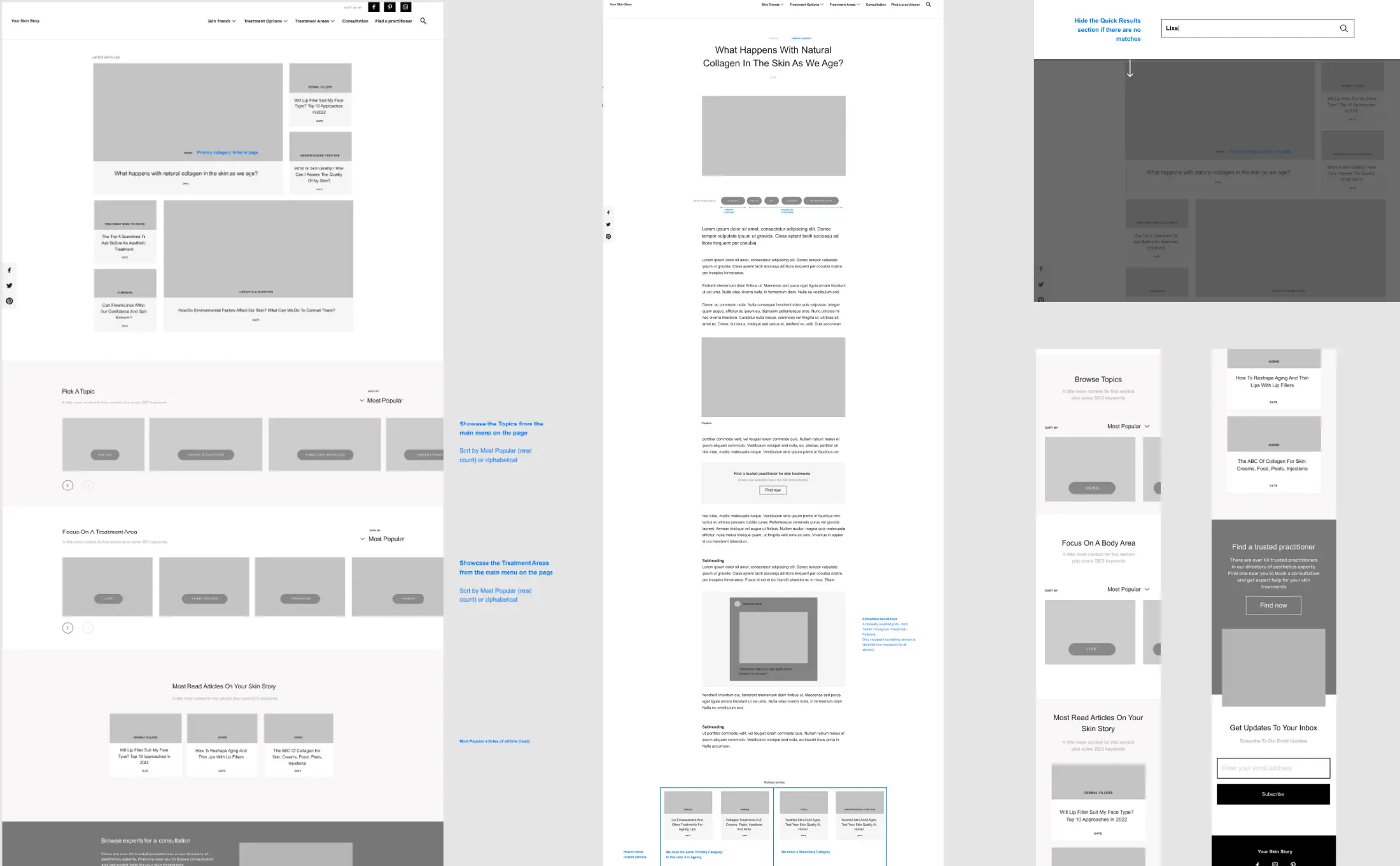
Wireframes
I explored detailed wireframes that met the users’ needs for an easy way to access information about beauty treatments. Key concerns included how users would navigate through site content, use filtering and sort menus, enjoy using a carousel, etc.
Many of these elements represented existing library components – we would need to re-use or adapt what we could, but to move quickly and explore ideas I used wireframes.
Step 6
UX Research
I conducted a rapid UX research study to validate our new navigation content. The previous content was poor; it was not user-centric, using buzzwords that did not match what people were searching for online.
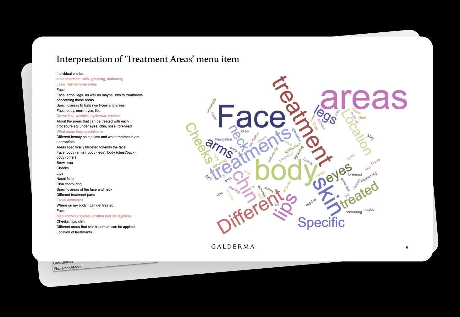
Perception testing the navigation
First, I gathered insight into how people interpreted the wording of our new navigation, to check our assumptions matched the users' expectations.
I learned that some words aligned with our expectations, others could do with a re-think to ensure users browsed the site in the way we hoped they would.
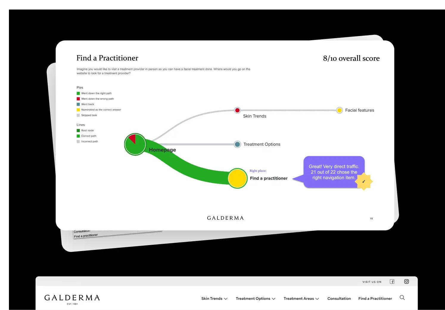
Tree testing the navigation
I also tested the comprehension of our new navigation. I set tasks to testers to find particular things on the website using just a word-based prototype.
We learned that our most important navigation items performed well – users could find what they were looking for. Some words were more ambiguous, so we discussed tweaks before moving forward.
Step 7
How did we design the UI?
There was a Design System in place with a library of components. I re-designed the site using existing components, tweaked some components to meet our needs, and added new ones for search.
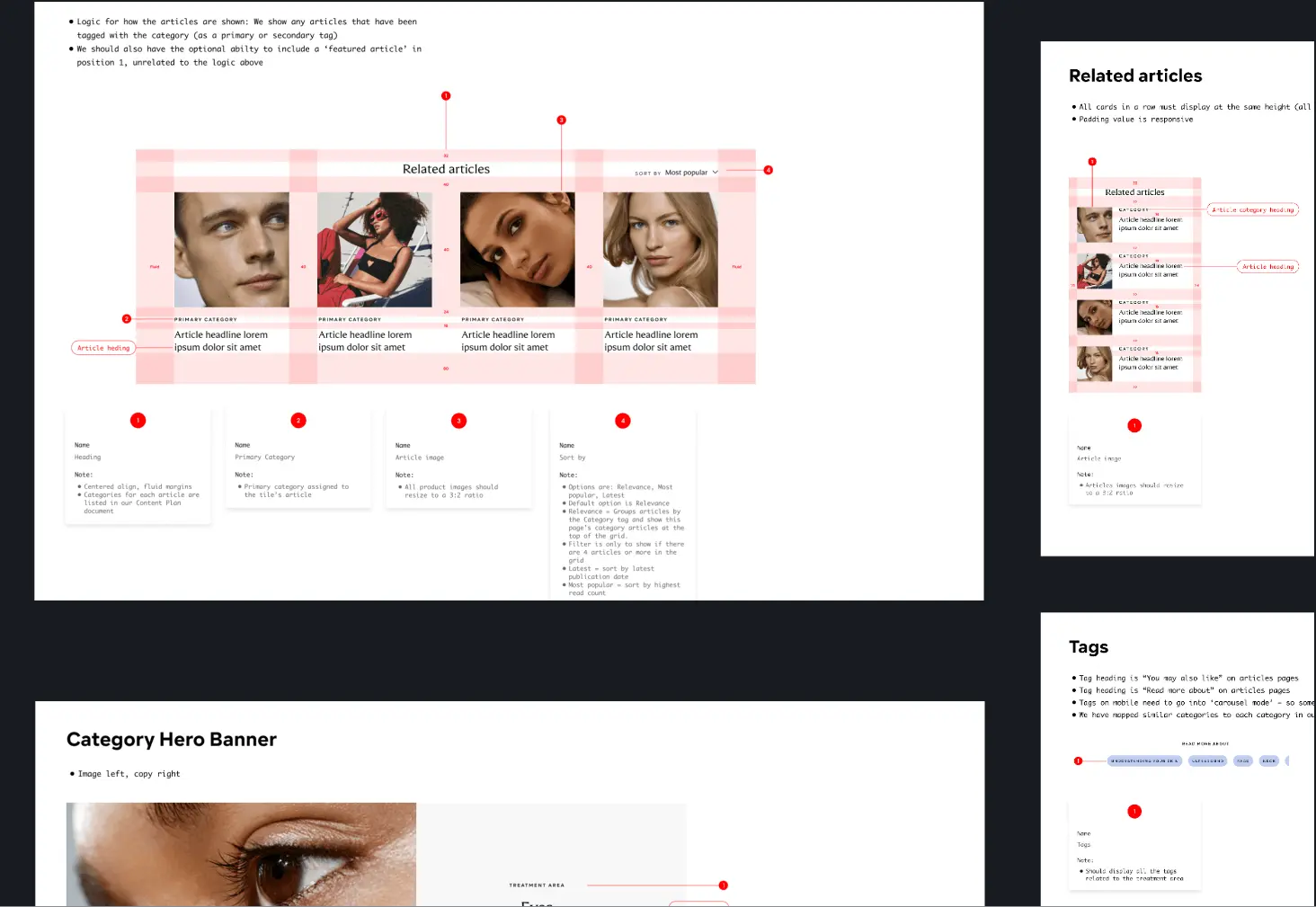
Component specs
Working with an existing UI kit was a bonus. Many flows and experiences could be built quickly using what was there.
For some components, we needed to make tweaks to support experiences. I worked alongside a visual designer to make changes, and I wrote up the specs for the library.
The only challenge was the navigation, which could not evolve as it was global, so we worked within the current UI framework.
Final solutions
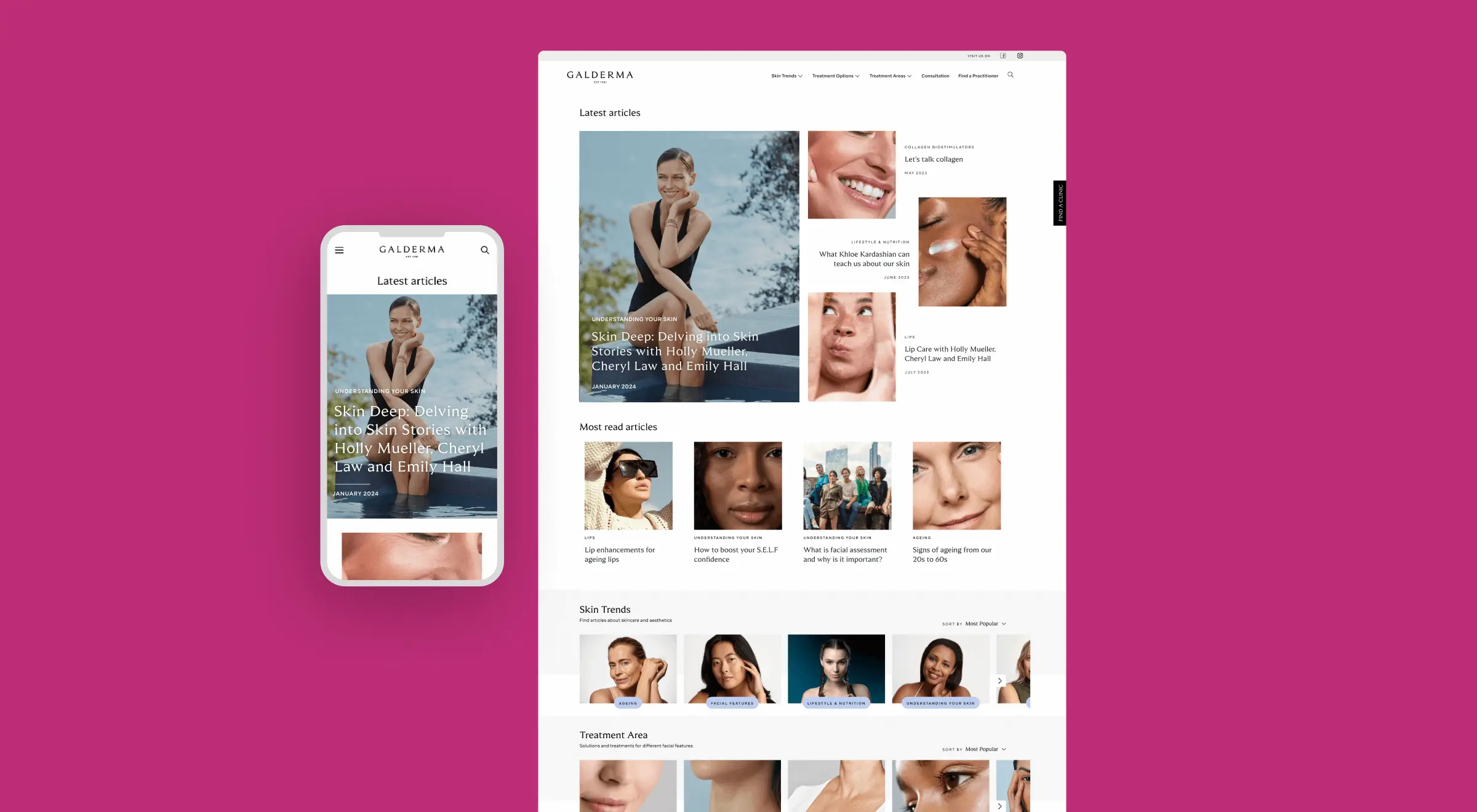
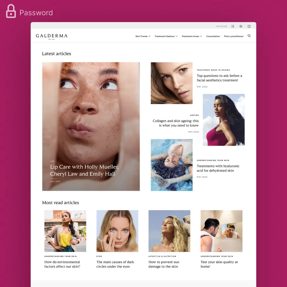
See some of the solutions I defined. To see the website, go to https://www.galdermaaesthetics.com/au
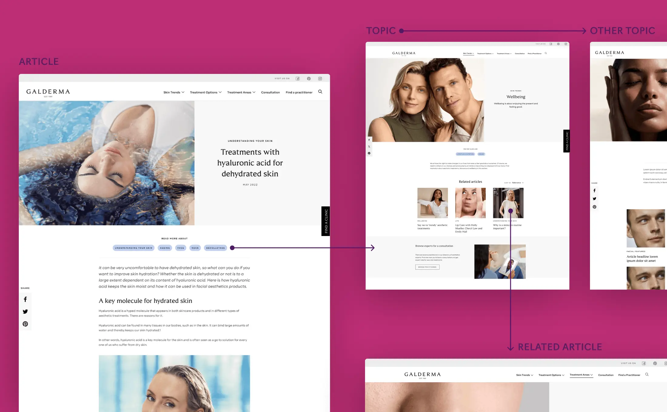
Tag system for continued browsing
One objective reached by design was helping users easily navigate to multiple pages. The user journey often starts at an article page by searching in Google for a term. Once on an article page there are tags and related articles, to help users reach additional pages. Increased page views per visit means more trust in the site and likelihood to use the Find a Practitioner function (our key metric).
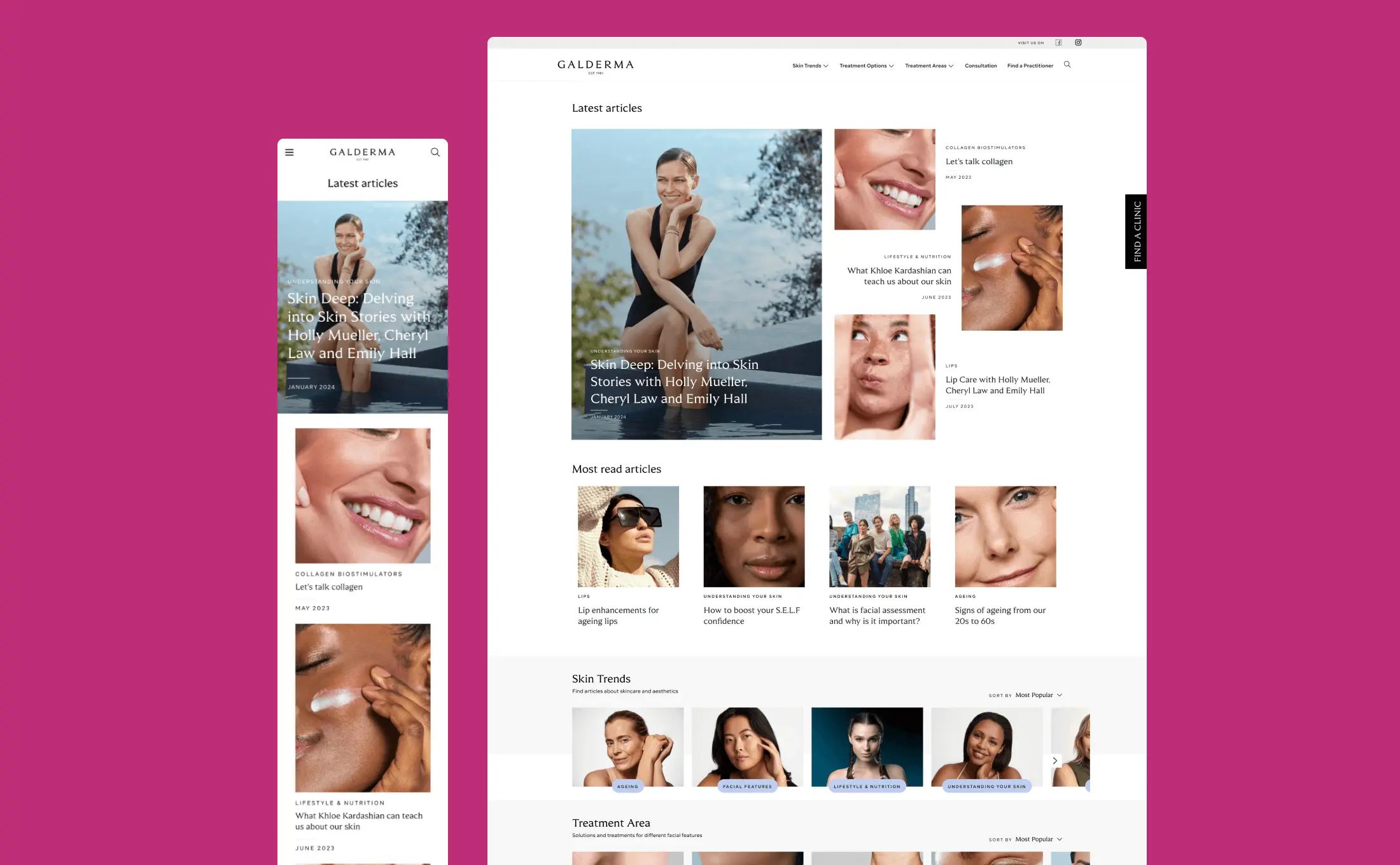
Editorial style homepage
With our target audience in sight, I designed a layout that had an editorial feel to it. From the personas, I envisioned a woman (our demographic) on her sofa with a tea browsing on her iPad finding impactful information, while enjoying the lightness of the experience!
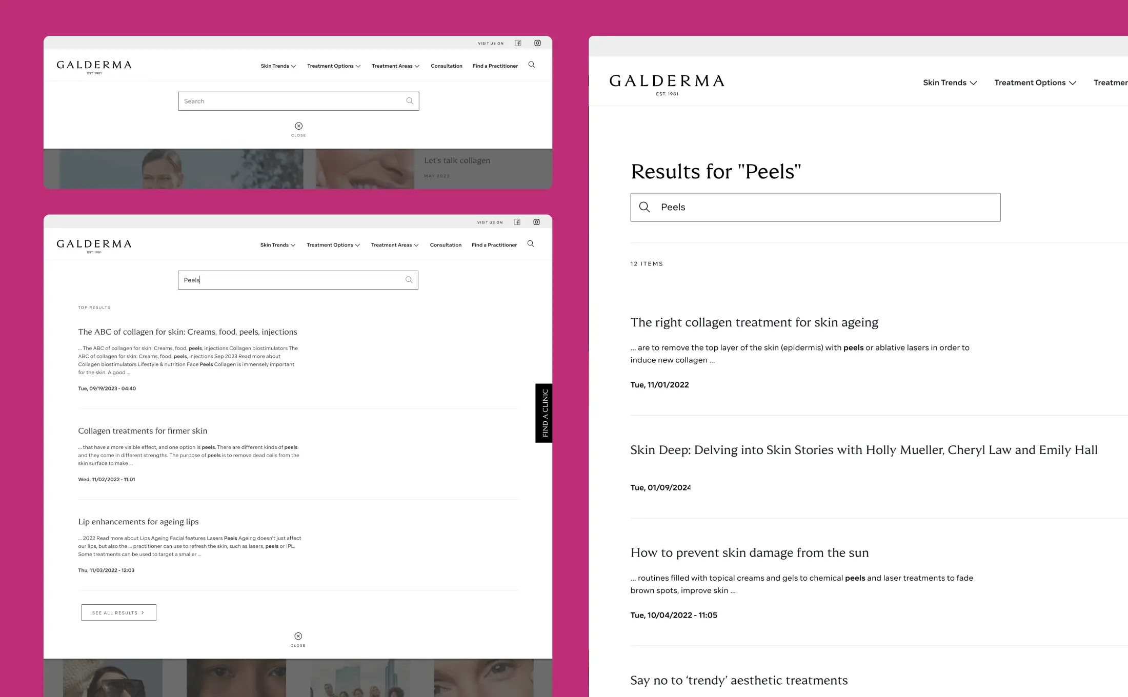
Easy search
From the customer research, we knew there was a need to access
expert information based on science. I designed experiences for
Search so that specific insights were easy to find.
I included a quick results popover, made sure keywords were
highlighted in search results, and made sure it would operate
nicely on mobile.
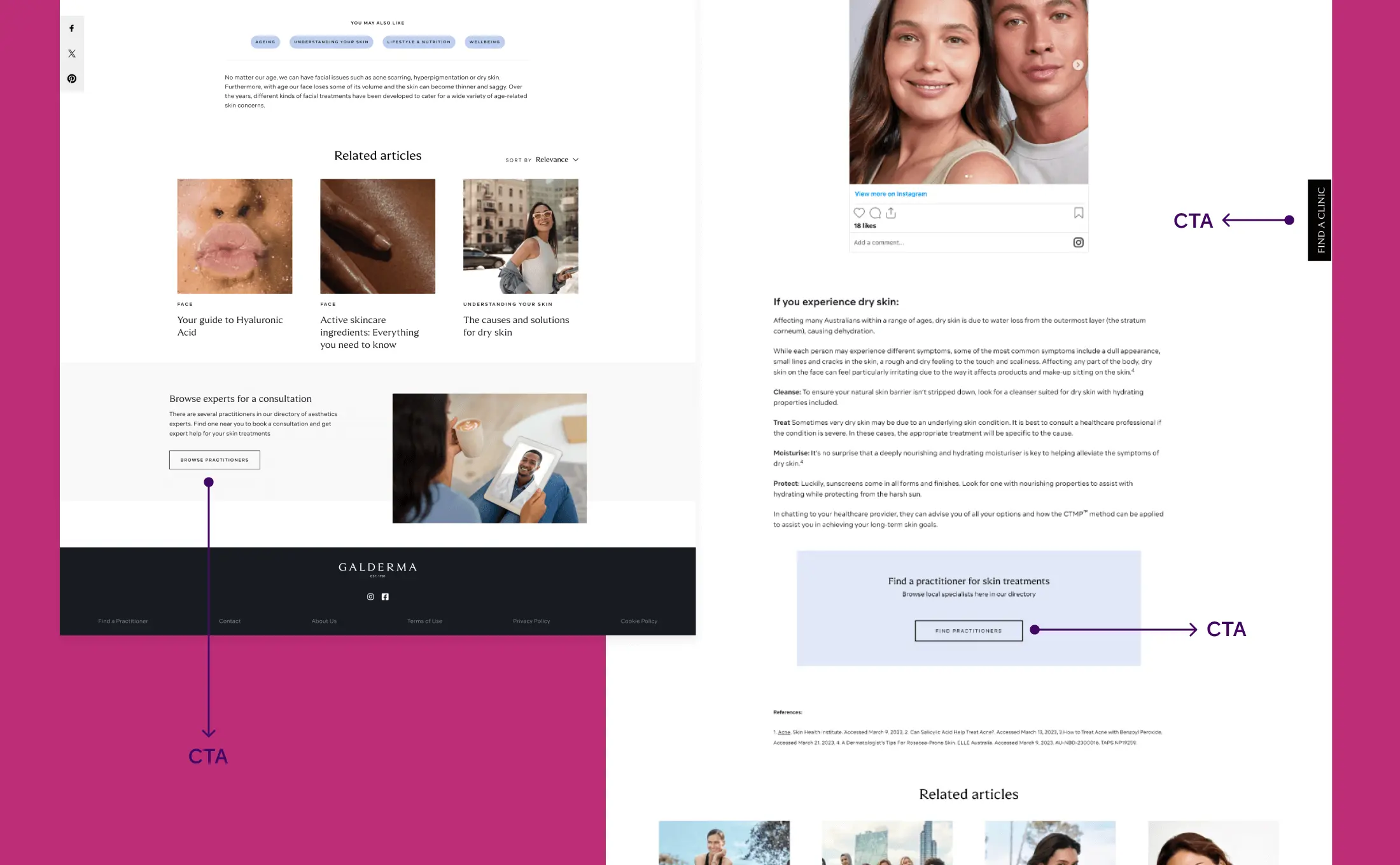
Lead conversion
The practitioner directory already existed from an earlier
version of the website. I made sure to place bold and noticeable
CTAs to the directory at the right place on the page.
I also designed a permanent button that would still behave with good usability on mobile.
The impact
The results of this project have been really spectacular. Read on for specifics
Better engagement
Galderma have significantly improved engagement on their website. Page views per visit have increased due to better layout, content, navigation, and a tag system. Bounce rate has also decreased.

Increase in lead conversion
With more web traffic and bolder CTAs, Galderma have been able to capture more consumer leads through the Find a Practitioner page.
Increase in traffic volume
With a website that can support a new range of topics, plus with the renewed excitement of a fresh appearance, more articles are being published, and web traffic is hugely up.
More from Camille’s portfolio
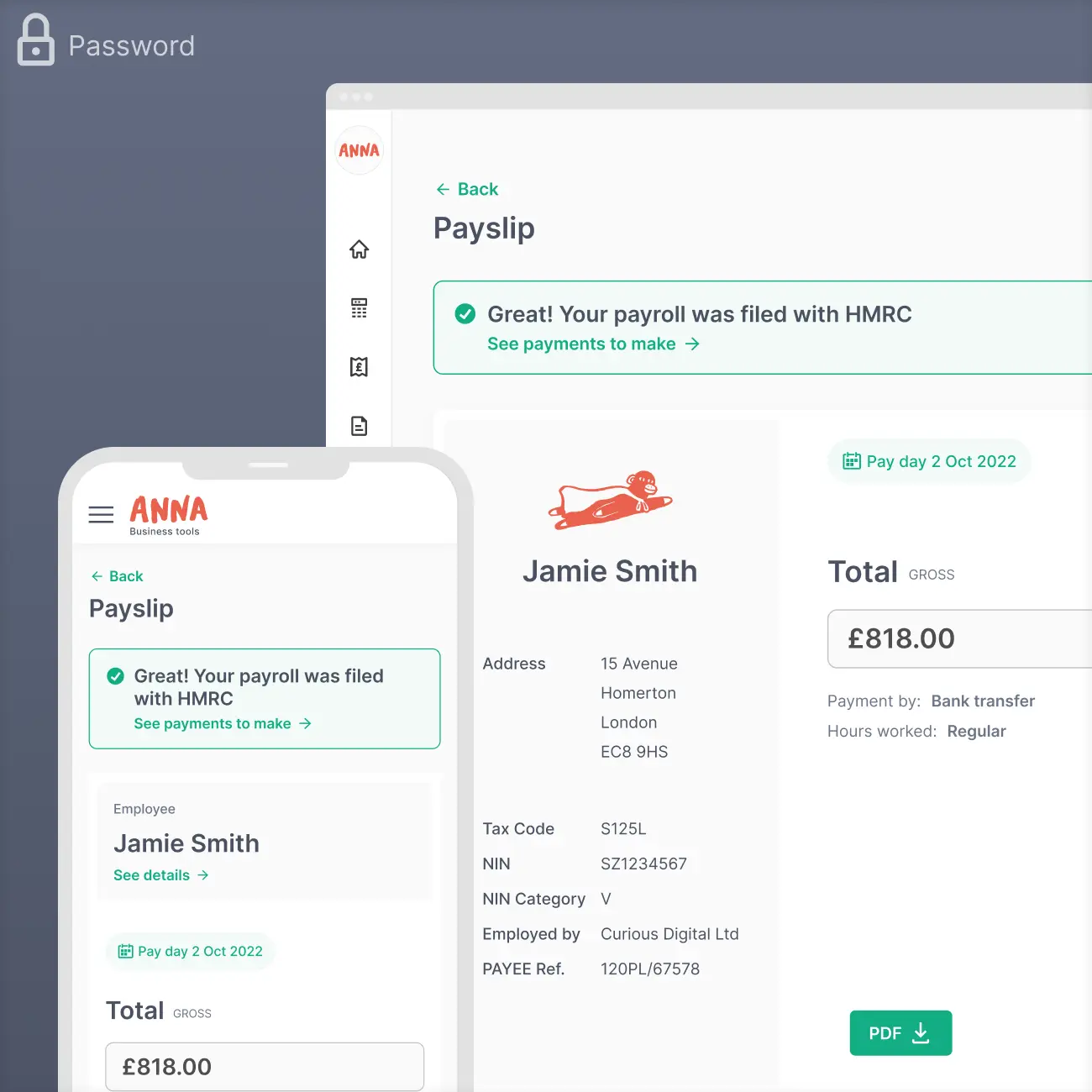
Payroll for ANNA Money
PRODUCT DESIGN
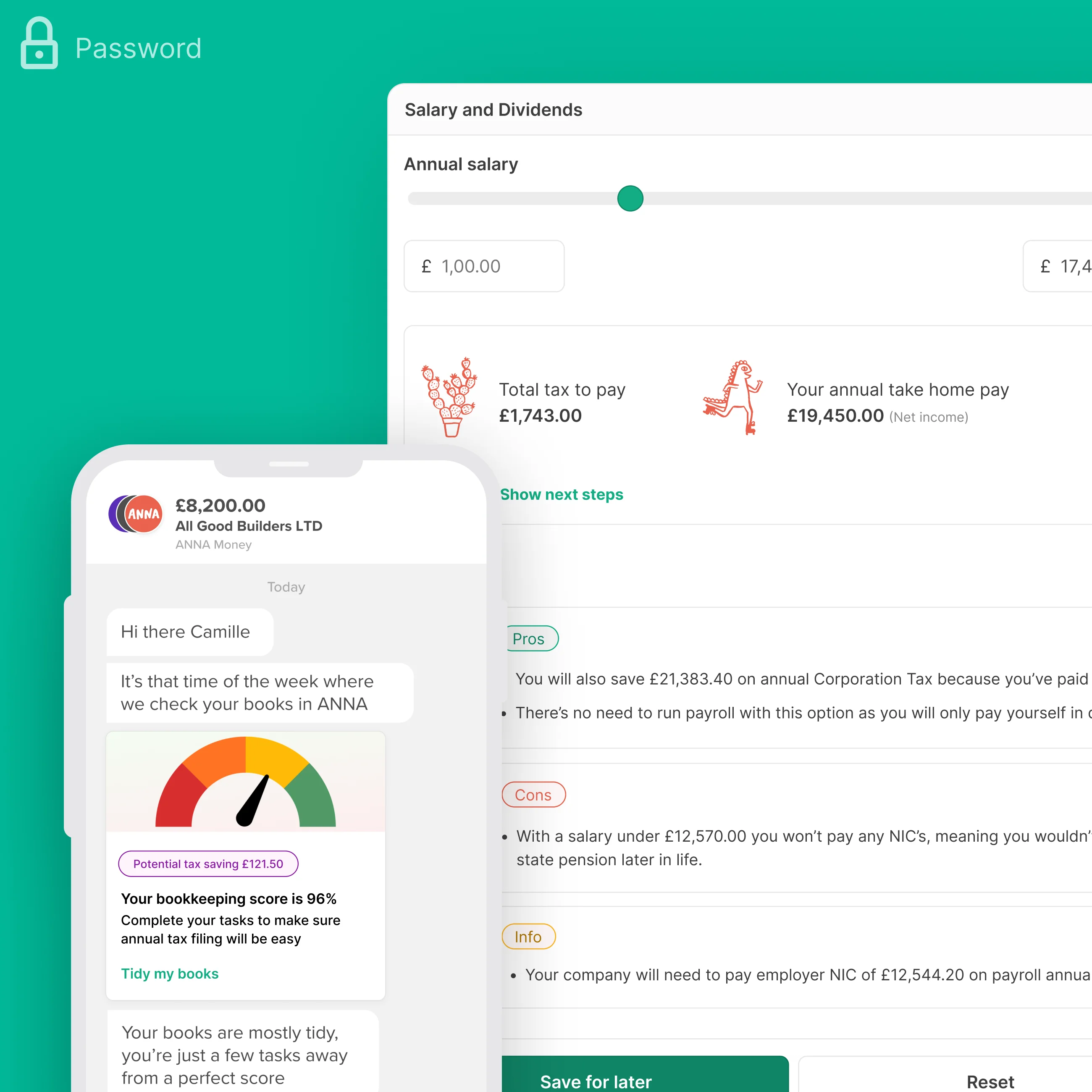
+Taxes for ANNA Money
PRODUCT DESIGN
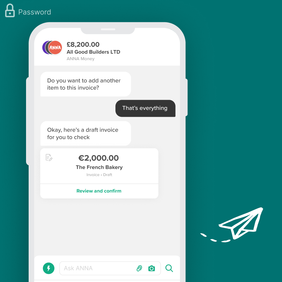
Invoicing for ANNA Money
PRODUCT DESIGN
Galderma SEO Microsite
UX DESIGN
Techspace
UX/UI DESIGN
Xero Pricing Plans
UX/UI DESIGN