Techspace
I redesigned Techspace's mobile app and web platform so that people could more easily book meeting rooms.
My role was to:
Year
• Conduct research
• Define the UX
• Conduct UI Design
2018
Who is Techspace?
Techspace provides shared and private workspaces in London and Berlin for innovative start-ups and scale-ups.
The challenge
The aim was to redesign Techspace’s system for customers to book meeting rooms so that it was more user-friendly and on brand.

Our objective
We had a hypothesis that customers found the current meeting room booking system difficult to use. Our aims were to:
- Discover problems and unmet needs in the current experience.
- Re-design the tool and increase customer satisfaction.

Who was on board?
- 1 UX Design Lead – Me
- 2 Developers

My contribution
I conducted UX Design and UI Design. Our CTO signed off the solution.
Time frame
3 months to conduct research and redesign solutions for both platforms, along with other projects on the go.
Step 1
Conduct UX research
First of all, I conducted research to uncover problems with the current experience.
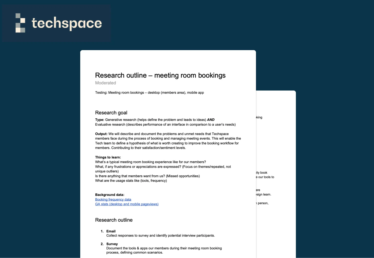
Research outline
I made a research outline to make sure I had clear and concise goals.
I set out to document the problems and unmet needs that Techspace members faced while booking and managing meeting events.
This would enable us to improve the booking workflow for members.
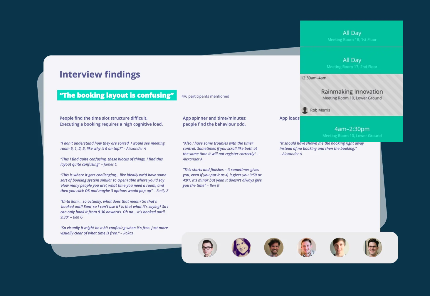
Interviews and results
By speaking to users, I discovered some key insights.
- Users were confused when trying to search for a room and make a booking
- Controls on the mobile app were causing user errors
- There was often not a room available to book, but rooms were in fact empty
Step 2
Competitive Scan
I scanned the market for related solutions, and general inspiration.
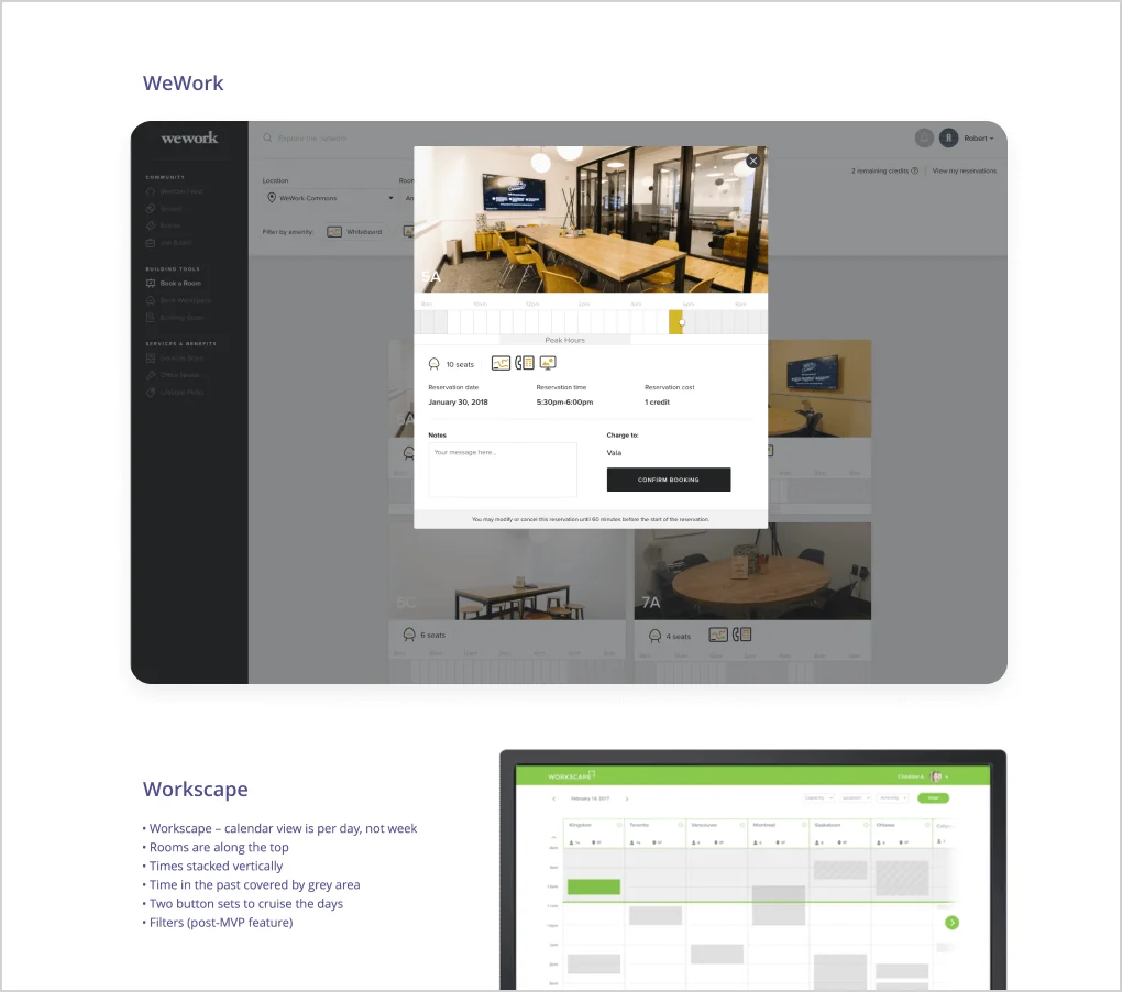
Relevant solutions
I signed up to products that already solved the problem of easy room bookings, and made notes of what felt clear and what felt confusing, along with any interesting opportunities noticed.
Inspiration points
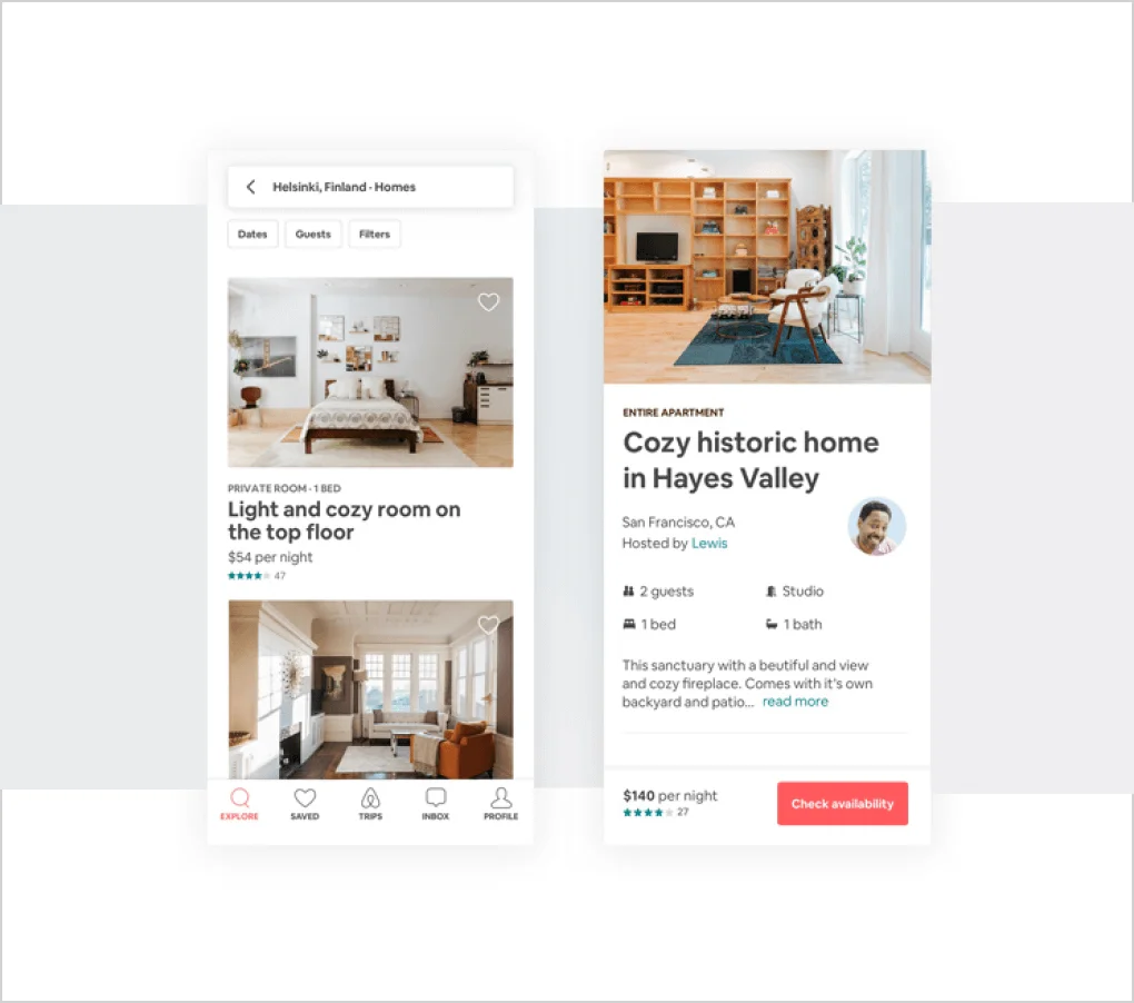
At this time in 2018, I was inspired by AirBnB’s search and result functionality. The design patterns found there were successful and setting a standard.
Step 3
Wireframes and user testing
I explored solutions in wireframe format and tested prototypes with real customers.
Wireframes
Early in the design phase I played with ideas using paper sketches. I then translated these to wireframes and explored how to find solutions to user problems in the simplest interface.
User Testing
I created fully interactive prototypes for desktop and mobile and tested these with users by observing how easily they completed tasks.
Step 4
UI design and developer handover
In 2018 I was using Sketch (prior to Figma) which meant writing up clear specifications for development.
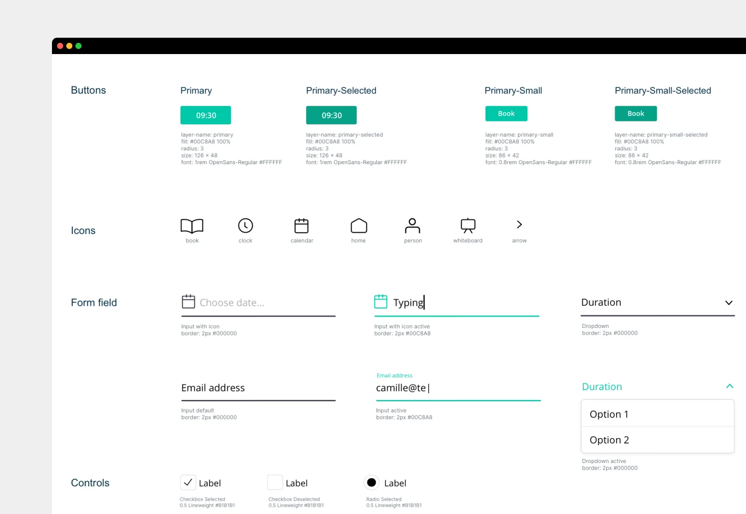
Design Library for the web
I created a design library for the web elements that were required.
I considered all states, eg. how buttons and fields would look when active, disabled, in focus etc.
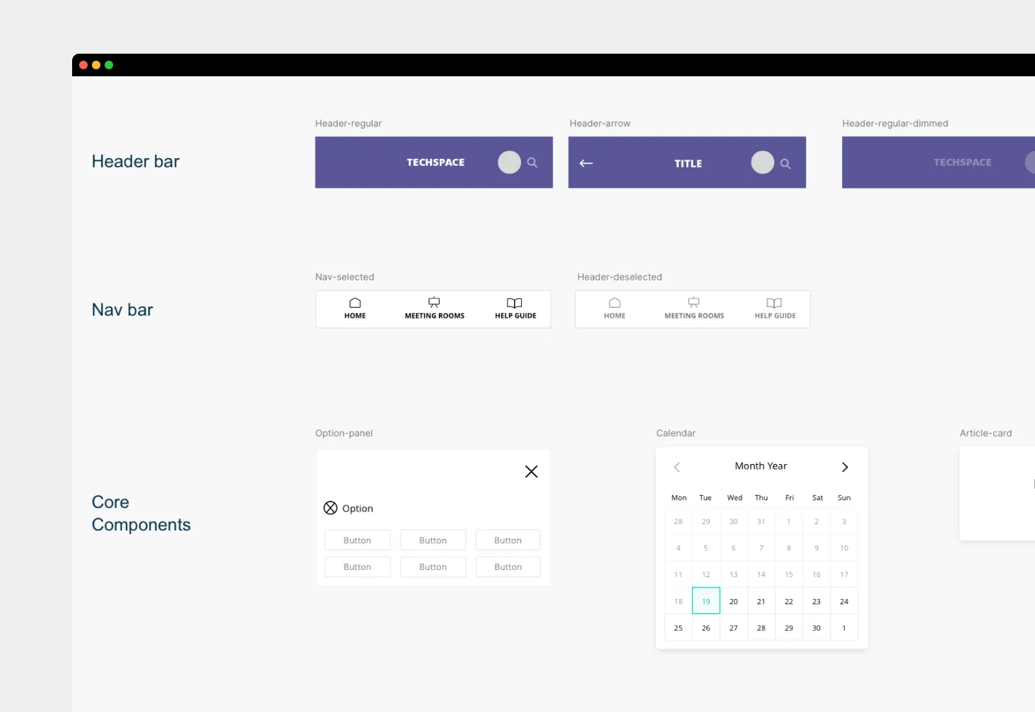
Design Library for the mobile app
I created a design UI Kit for the mobile app for development to work from.
I designed some custom elements, such as a calendar, because choosing individual days and time periods using native controls had shown to be painful in the current version based on my research.
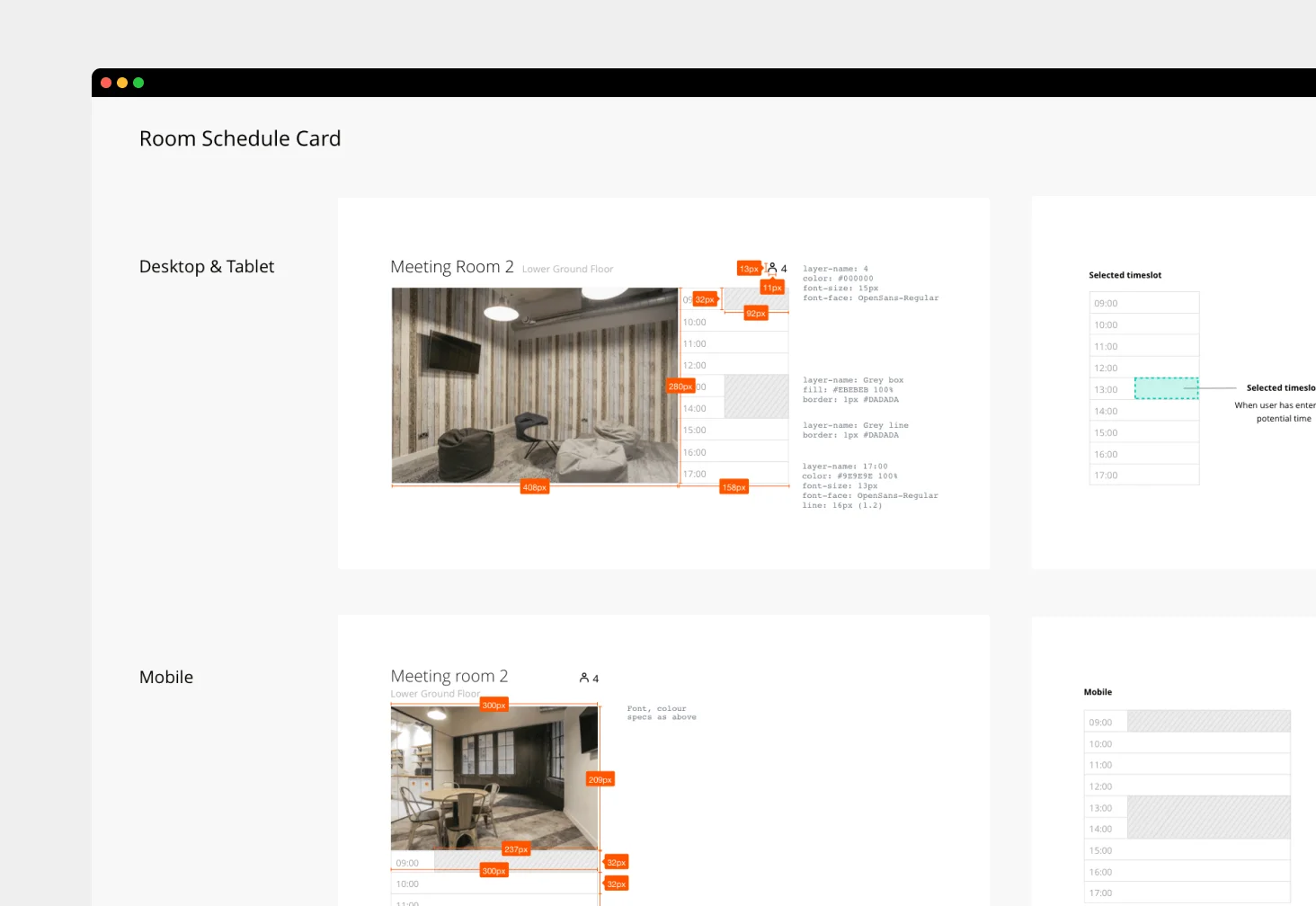
Component specifications
At this time before Figma was widespread I used a Sketch plugin to quickly generate specs for the development team.
This ensured they would build items with the right sizing, spacing, padding, etc.
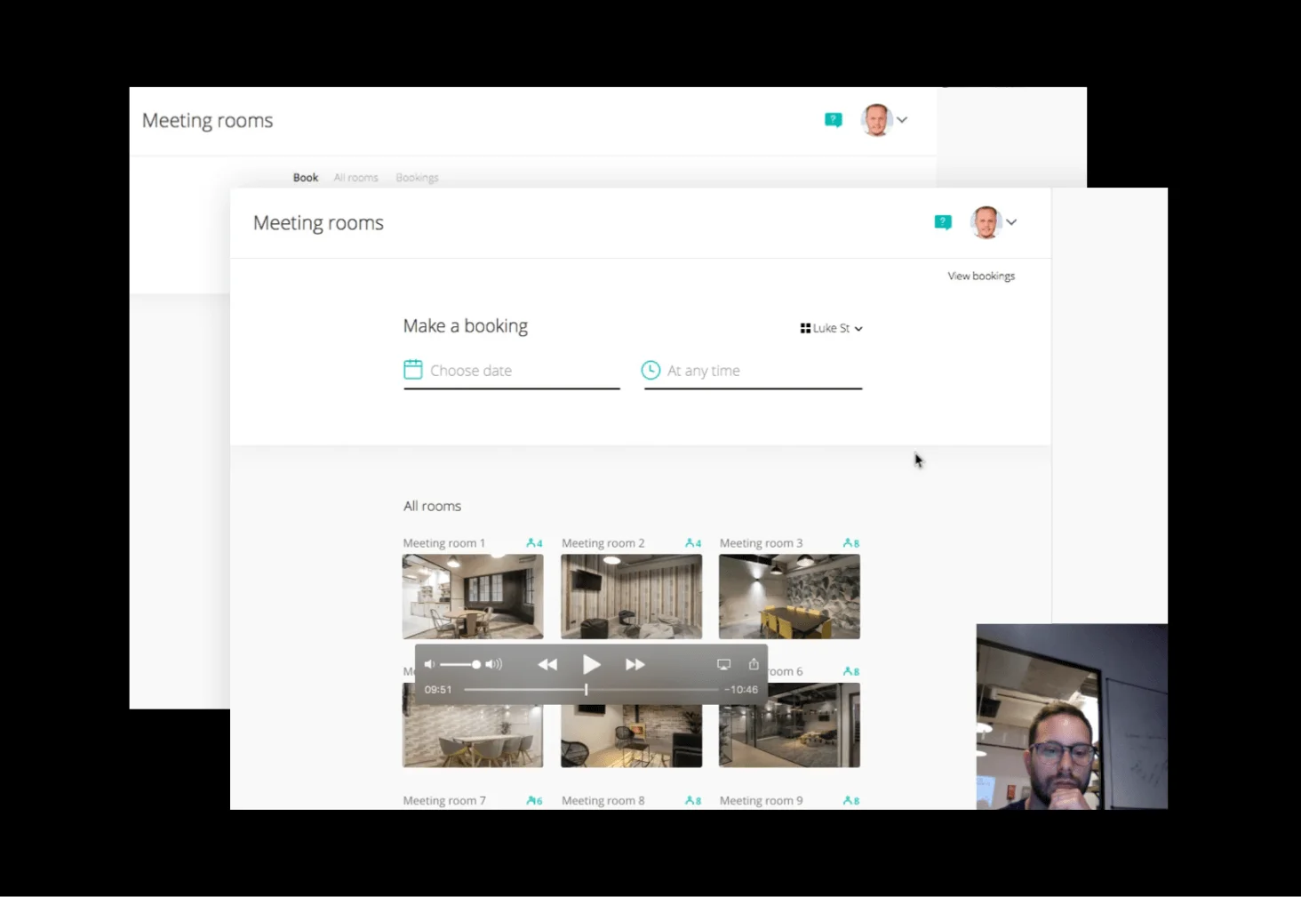
Final solutions
Take a look at some of my final UX/UI design solutions for Techspace.
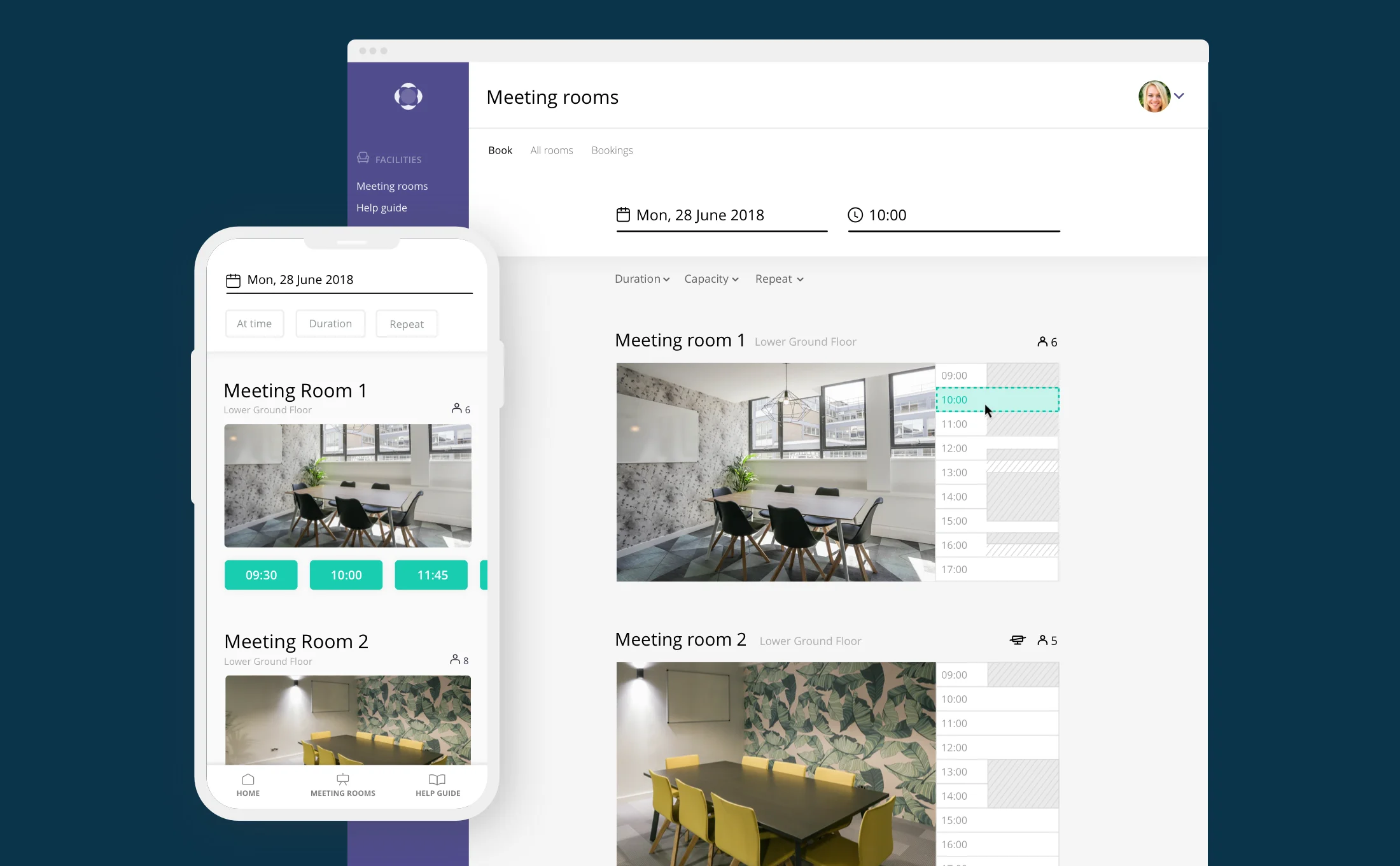
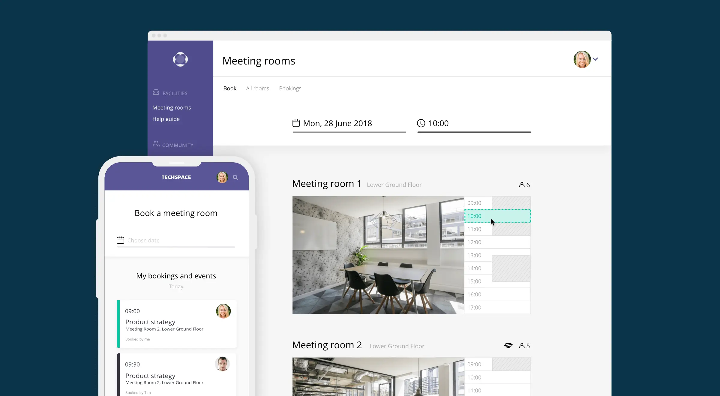
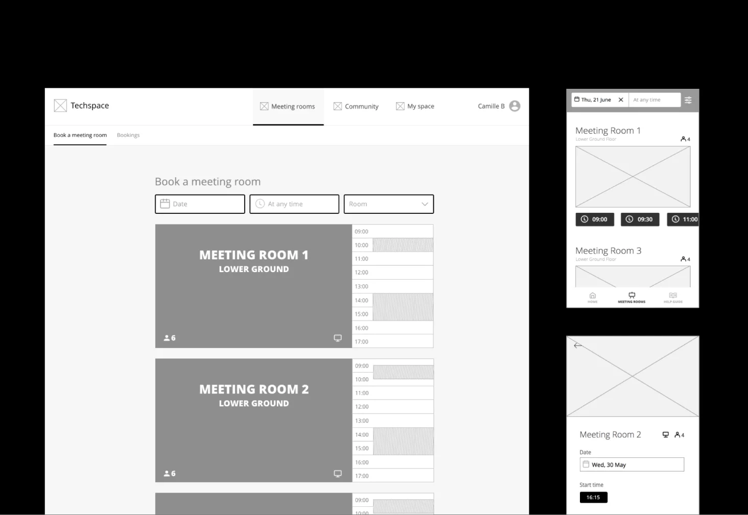
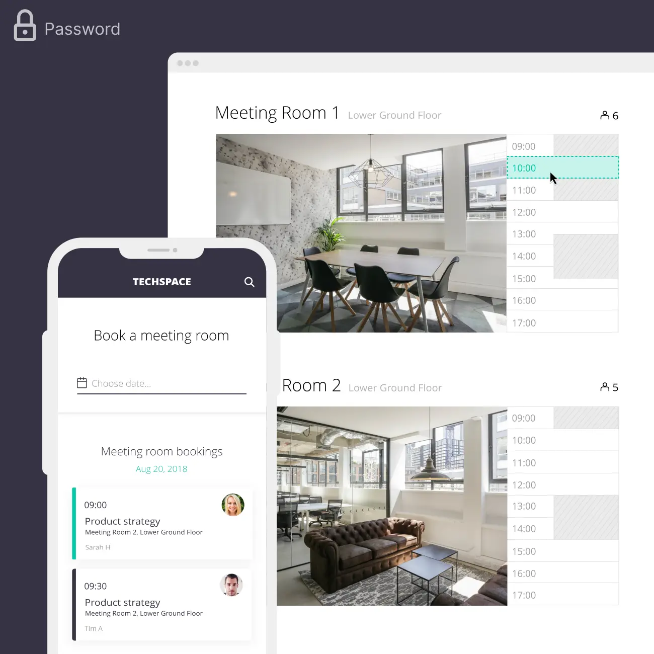
Easy to find a time slot
Users could now search for a room and compare options without getting so confused.
I switched to clear language, used a straight-forward sorting order, and an obvious design layout, with a large room image alongside availability. Here I established a visual device that showed a room’s current bookings that could be interacted with to book a time slot.
In the mobile app, I highlighted which times were available in simple buttons. I added refinement options for the user to get closer to what they wanted, eg. duration and capacity.
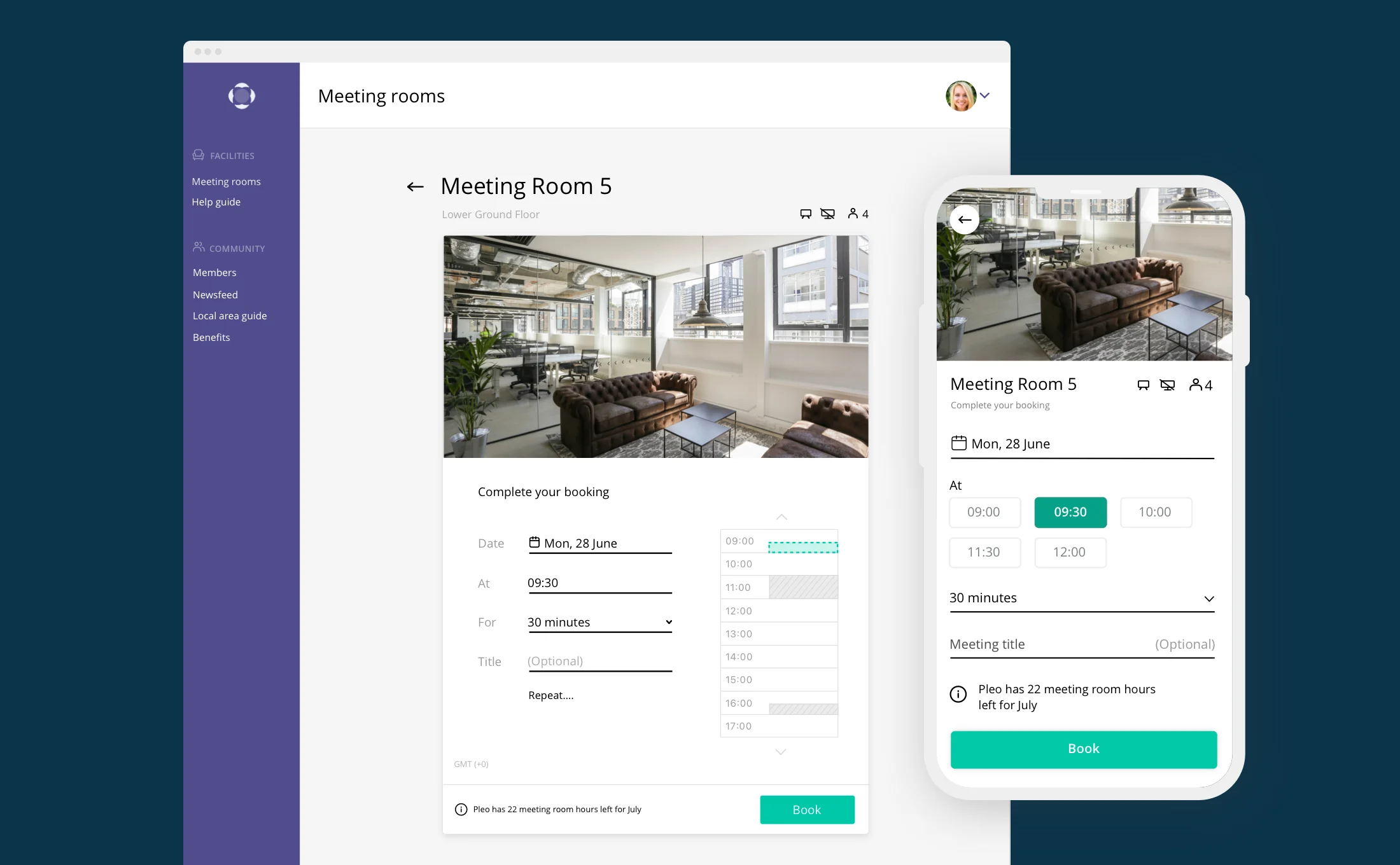
Complete a booking, nicely
I updated the booking form to be easier to use. Users had found native spinners in the mobile app to cause them mistakes and frustration, so I switched to form fields such as dropdowns and buttons to make adjustments.
Users told me they expected to be able to add 'repeat' functionality after they had identified a favoured room and time slot, so I added a function to do this. It's not shown here, but when the chosen room was not available to repeat at that time, I suggested similar options, inspired by Google Calendar.
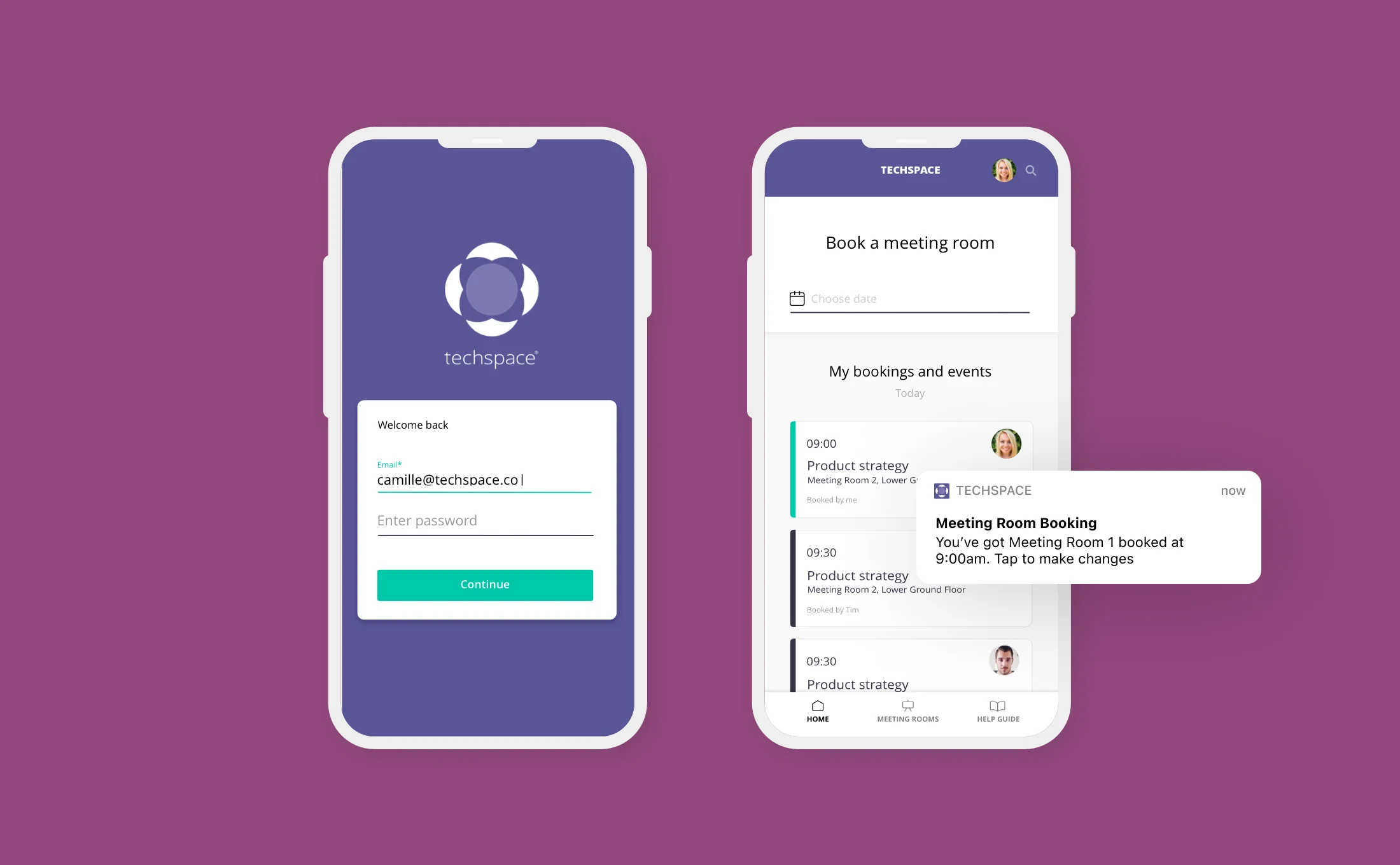
Booking reminders and easy cancellations
Customers mentioned in research that it was hard to find an available room, yet rooms were regularly going empty at the same time. There was detrimental behaviour that people were booking rooms and not cancelling them when no longer needed.
This was causing friction in our customer base. I redesigned our app to show bookings on the landing screen in the app, for easy access to cancel them. I also added notifications that reminded users about their bookings and gave them access to make changes. Combined with company communication, this helped solve the problem.
The impact
Here are some of the positive results that were achieved.

A better UX
We received a better feedback rating after updating the experience. They found it to be more easy to use and much more advanced. I tracked sentiment before and after using NPS.

Increased business value
With a more user-centric and fully-featured product, the release enabled Techspace to upscale in value. The product was discussed to be white labelled and sold as a SaaS product.
Change in bookings
I collected data before the redesign to track how many bookings were being made on each platform. After the new designs were implemented, more rooms were booked via the mobile app than before, suggesting a UX improvement here. We also saw an increase in cancellations which was good to open up room availability.
More from Camille’s portfolio
Payroll for ANNA Money
PRODUCT DESIGN
+Taxes for ANNA Money
PRODUCT DESIGN
Invoicing for ANNA Money
PRODUCT DESIGN
Galderma SEO Microsite
UX DESIGN
Techspace
UX/UI DESIGN
Xero Pricing Plans
UX/UI DESIGN